blog

Chart of the Month: August 2022

August 3, 2022

From Small Things: North American Venture Capital Compared to the Russell 3000 

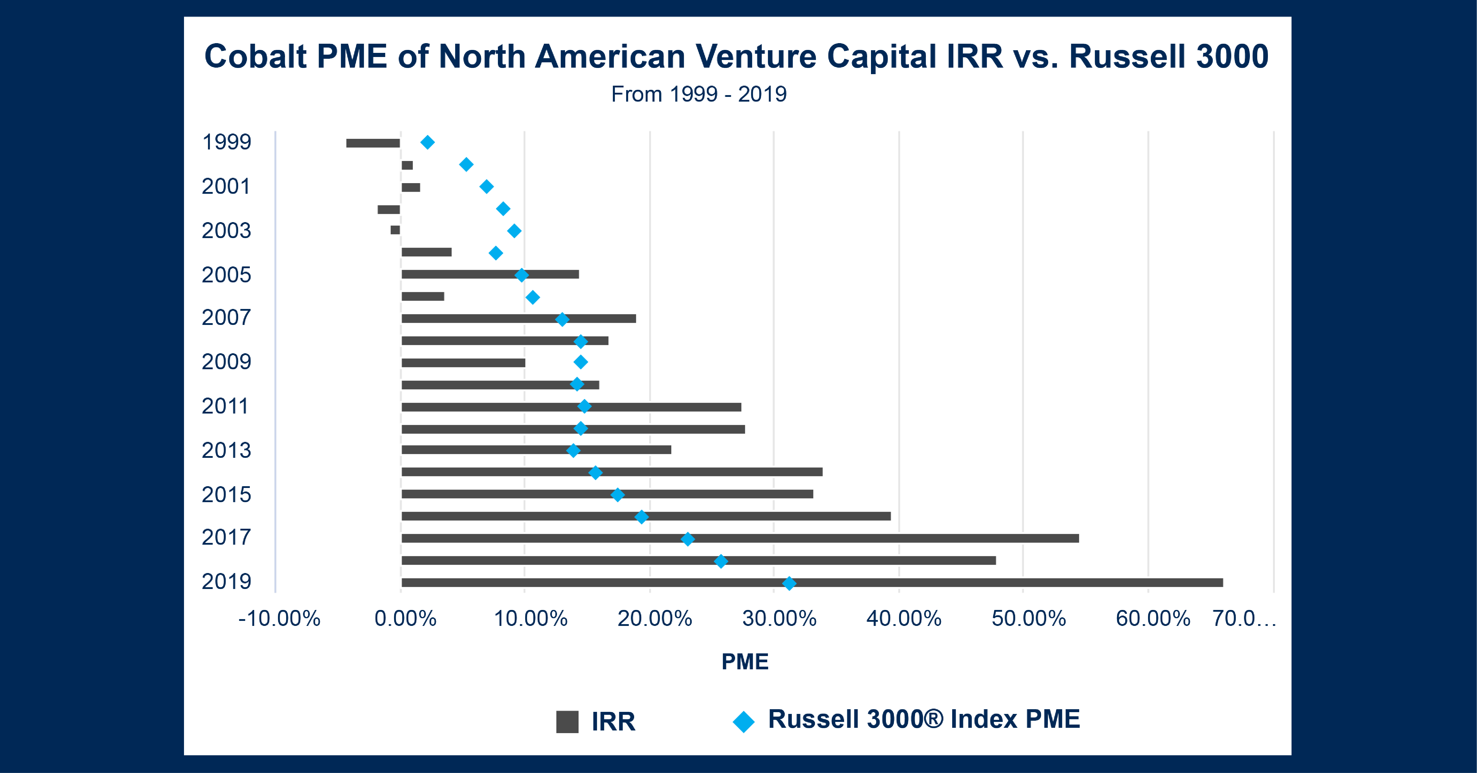
Last September, we did a study examining buyouts vs. the Russell 3000 in the context of the economic volatility of 2020. This month, we’re revisiting this idea applied to a different section of the private markets: venture capital. Given that the present economic shakeup may have significant effects on the tech leaders of the 2010s, we thought it prescient to look at how the future innovators have been performing compared to the public markets. Using Cobalt’s in-house PME calculation, we compared the two indexes over the past 20 years to see what factors may inform performance. 

Key Takeaways:

  • Our last chart emphasized how buyouts could often take advantage of weaknesses in the public markets. By contrast, we see the unique issues suffered by the venture capital market—the market was heavily impacted by recessionary events, even compared to their public counterparts. While public markets do stall out during recessionary events, there appears to be a sharp decline in venture performance for funds raised around these periods, likely due to a pullback in investments and demand leaving many of these fledgling companies out to hang. 
  • In the second half of the chart, we see another trend at work. While the dot-com bubble clearly impaired the venture capital market for a long time, venture quickly rebounded from the global financial crisis and accelerated far quicker than the public markets. While the “everything rally” of the last 10 years raised all ships, venture capital seems to have been especially productive during this time. This is likely due to its positioning allowing for far greater growth than more established markets.

Looking Ahead:

  • Having flirted with two recessions in the past three years, there is much speculation on the direction of financial markets. The 2020 recession proved remarkably short-lived, and the present turmoil continues to teeter on the fringes. Venture capital is not at the heart of the drawdown so we can extrapolate that while the venture market may suffer acute setbacks from investor jitters and denominator effects, overall interest will remain strong and could likely bounce back faster than public markets. 
  • Given that many of the largest drawdowns in the latest downturn have been in the big tech sector, there may be even greater opportunity for innovative venture-backed companies to rebound and feast on the lost market confidence in the former innovators of Big Tech. 
This blog post is for informational purposes only. The information contained in this blog post is not legal, tax, or investment advice. FactSet does not endorse or recommend any investments and assumes no liability for any consequence relating directly or indirectly to any action or inaction taken based on the information contained in this article.
blog

Chart of the Month: July 2022

July 7, 2022

MENA Reversion: The Roots of Current and Future Trends in Emerging Markets

The recent break in the years-long trend of the everything rally across markets means that strong portfolio performance might be harder to come by rather than being a given. This will cause investors to look elsewhere for alpha, whether it be different markets, focuses, or geographies. With that in mind, we examined emerging market datasets within Cobalt Market Data to see which of these markets has been most popular, by both total number of funds as well as fundraising amount.  

Note: Cobalt Market Data does have an Asia-Emerging classification, but this segment has been removed from this analysis due to being an extreme outlier among the markets in both metrics. 

Key Takeaways:

  • When these geographies are grouped, the first thing that stands out is that Latin America and MENA (Middle East and Northern Africa) are far outpacing Sub-Saharan Africa and Europe CEE/CIS (Central and Eastern Europe). Latin America (305 funds) and MENA (312) account for 64% of funds raised in the set, with Sub-Saharan Africa (172) and Europe CEE/CIS (180) making up the other 36%. 
  • Interestingly, MENA’s fundraising total ($64.5 billion) is closer to the smaller two markets than it is to Latin America ($99.8 billion). Latin America is an area of high fundraising activity at larger total fund sizes, while MENA is also an area of high activity, but at a smaller average ticket. 
  • After digging into the numbers, the root of the discrepancy becomes evident: 47.6% of all dollars raised in Latin America are attributed to Buyout funds, while Venture and Growth Equity accounts for 16.3%. Conversely, Buyouts are only 19.6% of the MENA market, compared to the region’s 58.6% in Venture/Growth. The different approaches in each region account for the differing dynamics in fundraising totals. 

Looking Ahead:

  • As the MENA market continues to mature, it will be interesting to see if the pattern between the two regions remains consistent or begins to evolve. We believe that the makeup of the MENA markets will remain for two reasons: the sources of capital and economic ambitions of the region.  
  • Regarding the capital sources, sovereign wealth funds of the region have been investors in private equity portfolios for some time and more often they are looking to invest domestically, along with their current North American/other developed market commitments. Moreover, the economic ambitions of many countries in the region are focused on hyper-modernization over the ensuing decade. This structure bodes well for venture capital funding, as rapid growth and expansion of companies and services in a growing economy lends itself well to the venture model. 
  • Zooming back to include all regions, there has been overall growth in emerging markets. From 2000-2009, 223 funds raised $58.9 billion in these regions. In the following decade, from 2010-2019, 523 funds raised $125.4 billion. If this growth continues, we expect over 1000 funds to raise over $250 billion in the regions by the end of the 2020’s. We would not be surprised in the least as well if we look back in eight years and these numbers have been surpassed. 
This blog post is for informational purposes only. The information contained in this blog post is not legal, tax, or investment advice. FactSet does not endorse or recommend any investments and assumes no liability for any consequence relating directly or indirectly to any action or inaction taken based on the information contained in this article.
blog

Chart of the Month: June 2022

June 1, 2022

Making Sense of Contrary Indicators in the Developed Credit Market

As predictions of contractions in private markets begin to rise, we thought it would be prescient to follow up our April chart and provide a counter examination of the extended credit market to elaborate on the demand trends in that sector over the past decade. To examine demand, we analyzed the market from two angles: by contribution rate and total contributions. This allows us to visualize the absolute demand, granular quarter-to-quarter shifts, and changes in demand independent of overall commitment size.

Chart #1

Chart #2


Key Takeaways:

  • In the first chart above, we see notable trends in commitment rates. Between 2013-2014, the overall rate peaks above 75%. This is well above average and indicates that this was a particularly popular time to invest into distressed opportunities, likely taking advantage of the market rebound following the global financial crisis.
  • Commitment rates trend down after 2014, reaching a low in 2021. In general, we anticipate long-term contribution rates to be around 40% of total commitment, so to see mean reversion is hardly surprising. The trend overshoots this goal and ends at around 35%, but this will likely be revised upwards to match the long-term average. The likely explanation for this is the lack of distressed opportunities in the 2010’s; once markets had completed their rebound, they continued to deliver into one of the most surprising bull markets in memory. As such, there was little opportunity for distressed investing until 2020, when opportunities were cut short by the remarkable rally.
  • How does this fit in with the second chart? We see a strong trend over time of increased investment, which can be explained by macro factors: the early years have suppressed values since we have a smaller sample of vintages. In 2017, total investment begins to increase at a sharper rate. This is partially due to the rising tide effect, as money poured into private equity in all spaces. This also explains the drop in contribution rate. More money was flowing into credit funds out of a demand for alternatives, but there was no increased specific opportunity flow, thus letting the contribution rate return to its natural state.

Looking Ahead:

  • As the drawdown of 2022 deepens and markets continue to contract, there may be a considerable number of credit opportunities emerging over the coming years. Because credit is uniquely suited to a distressed approach, it may not share the same patterns of drawdowns that other sectors of the private markets may experience over the next few years. Instead, it may pounce and see high demand (assuming valuations remain depressed).
  • We can also anticipate a short-term fall in contribution rates while markets contract, a period which could last until 2023-2024 depending on the severity of the drawdown. However, demand will likely spike again once markets fully rebound as seen in 2013.
This blog post is for informational purposes only. The information contained in this blog post is not legal, tax, or investment advice. FactSet does not endorse or recommend any investments and assumes no liability for any consequence relating directly or indirectly to any action or inaction taken based on the information contained in this article.
blog

Chart of the Month: May 2022

May 2, 2022

The Rolling Stone Gathers Momentum: Resilience and Investor Interest in Eastern European Markets

Eastern Europe has come to the forefront of current events this year with the conflict in Ukraine. Continuing our exploration from last month , we wanted to examine the private equity landscape of the region, given that it is often underexplored compared to the Western European markets. With that in mind, we used the Cobalt Market Data to analyze the total cash flows from 2010-2021 in Central and Eastern Europe.

Key Takeaways:

  • At the start of the decade, distributions were few and far between. This could largely have been due to the recession immediately preceding the 2010’s, as distributions across the board were suppressed throughout the market.
  • Conversely, contributions were still being made at the start of the decade, and the distributions finally did follow. Starting in 2015 and peaking at the end of 2017, the region accounted for over $3.2 billion in distributions in the middle of the decade.
  • These cash flows happened despite the Crimean conflict in 2014, as well as debt crises in the area, and the announcement of the Fed Tapering plan taking place in the same year. This may point to investments, at least in the private markets, proving to be resilient in the area despite surrounding uncertainty.

Looking Ahead:

  • Given the current unfolding situation, it would be foolish to say with confidence where the market is headed as things change from day to day. That being said, with Russia Ukraine being some of the of the largest economies in the region, the negative effects on the greater economy may be felt in the private markets.
  • After a brief period of lighter investment, the region did see an influx at the end of 2019. Based on the past trend from earlier in the decade, we may see a similar string of distributions 3-5 years later under normal circumstances. Time will tell if these will still be able to happen on schedule in the current climate.


blog

Chart of the Month: April 2022

March 31, 2022

The Suspension Bridge Loan: Examining European Credit Contributions

Given the recent turmoil in Europe, we wanted to examine how the level of investment into the region has changed in the past decade.  Using Cobalt Market Data and Analytics Engine, we analyzed the rate of contributions to credit funds in the wake of the European debt crisis to see how investor sentiment reacts to instability in European markets.

Key Takeaways:

  • There are two notable peaks of contribution in the above graph: 2014 and 2018. The first surge of investment occurred in the latter half of 2014, as GPs drew down about half of their unfunded commitments in these two quarters alone.  The reasons for this are myriad, but do largely draw from the prior crises.  The year saw renewed concern towards the Greek debt crisis as well as Euro devaluation against the dollar amidst an announced Fed tapering plan.  2014 also featured the climax of Ukraine’s Euromaidan unrest and conflicts with Russia.  As a result, investors likely found the continent’s instability as a ripe opportunity for further investment into a temporarily distressed market.
  • The second notable shift in 2018 was even more dramatic, with General Partners again piling significant contributions into credit in the latter half of the year. December of 2018 was a famously bad month in the public equity space around the globe.  Europe was no stranger to these drawdowns: experiencing sideways movement throughout the year until fears of US monetary contraction and economic disputes with China would drive global markets south.  Strong dollar policies may have led some investors to look outside the USD for returns and the opportunity of a weak Euro offered promising growth prospects in the short to medium term.

Looking Ahead:

  • Looking at the two recent spikes in credit investment, we can see that these are unsurprisingly fueled by economic drawdowns and uncertainty. As all eyes turn to the rise of European self-determinism amidst the present conflict, there may be significant economic changes, and therefore opportunities in the credit investment space.
  • As we look further ahead, it’s important to note that significant events can often ripple forwards, and any debt fallouts from the present instability may be revisited several times in the future as we saw in the example of 2014’s debt crisis. These risks and opportunities may raise their heads once again in the not-too-distant future.


blog

Chart of the Month: March 2022

March 1, 2022

Road Repair: A Comparative Study of Regional Infrastructure Investment

This month’s chart takes a closer look at the infrastructure landscape we analyzed back in August of 2021, and digs into the varying performance across geographies. Using the Cobalt Market Data, we looked at infrastructure funds from the past 10 years across North America, Western Europe, and Emerging Asia by IRR to understand how the investing landscape may be different across regions.

Key Takeaways:

  • Emerging Asia has offered the greatest returns over the past decade, with the highest top-quartile group, as well as the highest median IRR of 12.72%, compared to 11.08% for North America and 9.63% for Western Europe.
  • Western Europe offers the ‘safest’ option, with the lowest spread between the 1st and 3rd While not having the upside of the other 2 regions, Europe has given the most stable range of returns over the past 10 years.
  • Conversely, North America has the widest range of outcomes, with the lowest range for bottom quartile performers. While this could be attributed to the sheer number of North American infrastructure funds, the numbers do tell the story of a high-risk, high-reward investment environment.

Looking Ahead:

  • A number of global events should come to shape the next decade of infrastructure investment. Globally, the post-pandemic recovery will continue weigh heavily on resources put towards infrastructure. And while it may not persist for the duration of a vehicle with a 10+ year investment horizon, the supply chain issues being seen across the world may come to play a factor in this space as well.
  • In China, the Evergrande fallout may reverberate throughout the investing landscape of real estate and infrastructure in Emerging Asia.
  • In North America, the recently passed infrastructure bill will inject trillions of dollars in projects into the space, and it will remain to be seen how this affects the performance of the players in the space.
blog

Chart of the Month: February 2022

February 1, 2022

Outsized: Examining Three Index Returns Since 2009 with a Fund Size Factor

This month’s chart takes a slightly different approach and evaluates the factor of fund size and the effects it has had on recent performance returns in large markets.  To visualize the impact, we used Cobalt Market Data to pull two charts over the last decade: the first examining smaller funds with size under $1 billion, and the second looking at larger funds with size over $5 billion.  While the data on these large funds is largely concentrated in more recent years and may suffer from a smaller sample size, the chart still captures valuable characteristics of the effect that fund size has on performance.

Key Takeaways:

  • Firstly, these returns are clearly very similar in the first five years. Across the board, there was positive performance on average regardless of fund size. Given that this was the early years of the post-GFC bull market, a strong, albeit slightly volatile, performance return makes sense to see.
  • As we look at the later years, we start to see some patterns emerge. Real estate exhibits the lowest volatility in both graphs, and quite similar overall levels of performance. Regardless of size, the charts follow very similar timings of peaks and troughs, as well as in depth of deviation in drawdowns. This indicates that real estate’s consistency in performance is size agnostic. Since real estate is so consistent, its performance should stay constant as fund size is scaled.
  • By contrast, infrastructure and credit show significant deviations between the small and large samples in the later 2010’s. Overall, we see a trend of lower volatility in smaller funds, which may be somewhat explained by sample size. However, there are exceptions such as the sustained drawdown of small fund infrastructure in 2017. This is not present in the large fund plot, which exhibits volatility with an average a little above 0%.  Meanwhile, large fund credit exhibits consistently higher volatility, even through the 2020 drawdown and recovery. Examining these cases, we see that in some styles a size factor can emerge. In more speculative styles such as credit, size can yield economies of scale in performance, but with some leverage resembling risks. On the other hand, different fund sizes may be operating in different markets as seen in infrastructure’s disjointed performance.

Looking Ahead:

  • As the prevalence of large funds rises, we will see the greater robustness of the data on these firms as volatility will likely drop as sample size increases. Additionally, with the dramatic upswing in M&A over the past year, it is quite likely that we will see significant changes in volume of larger firms.
  • While real estate will likely continue to be size agnostic, we have seen eight out of the ten largest infrastructure funds raised over the last five years, demonstrating an impressive push for larger infrastructure investment. That may create a disjointed market from its smaller counterpart that could become further separated as the large fund space increases.
  • For credit, while greater fund size appears to allow greater scaling returns, those same returns may offer some pause to investors seeking safety. Since dampening volatility has not appeared over time, credit funds’ reversions may continue to be most painful at the larger scale.
blog

Chart of the Month: January 2022

January 5, 2022

New Year, New Trends: NAV vs. Dry Powder Over the Past Quarter Century

A New Year is the time for resolutions and change. With this mindset, we looked back at the private markets to see where momentum has changed and the trends that have formed over the past quarter century. Using Cobalt Market Data Analysis, we identified the relationship between NAV (net asset value) and dry powder and how it has changed over the years, dating back to 1995.

Key Takeaways:

  • At the beginning of the pandemic in Q1 2020, NAVs started to diverge from the trend over the previous decade in which the pair rose at similar rates. NAVs now sit at roughly double the amount of dry powder in the market ($2.6T vs. $1.4T).
  • While NAVs have grown at an accelerated rate, dry powder has stagnated over the past few quarters, even decreasing slightly from Q4 2020 to Q1 2021.
  • The last divergence between NAVs and dry powder was seen after the last global financial crisis, from 2009 to 2011 when NAVs rose as dry powder decreased. This may have been caused by firms increasing their spending on distressed, undervalued assets in the wake of the recession, funded mostly by existing capital on hand. After this, the above-mentioned trendline was set, where both figures were rising at similar rates throughout the rest of the decade.
  • One explanation for this latest emerging gap between NAVs and dry powder is that even Private Equity has not been immune to the ‘everything bubble’ of the past 18 months. Valuations across various asset classes, such as public equity, have experienced similar exponential growth the past 6 quarters. As for dry powder, this growth has been seen organically, meaning firms didn’t have to raise higher amounts of capital than normal, or use an outsized amount of the current supply to achieve this growth. Because of this, we see dry powder staying relatively steady, rather than an upcoming large growth or depletion.

Looking Ahead:

  • Based on the previous financial crisis recovery, we should expect NAVs and dry powder to again align on a similar growth trajectory in the next 1-2 years. That being said, there are new circumstances and lingering factors (supply chain issues, inflation concerns) that may come to shape a different relationship between the two over the next decade.
  • No matter the relationship between the two trendlines in the near future, it seems highly unlikely that we will see dry powder surpass NAVs any time soon, as they last did in Q2 2009.
blog

Chart of the Month: December 2021

December 1, 2021

Across Two Ponds: Taking Another Look at Regional Real Estate from 2010-2021

As the true extent of the cracks in China’s real estate market continue to unravel, we thought it would be prudent to examine the market again after October’s Chart of the Month, namely looking at the quartile breakdown of the three dominant real estate markets. We analyzed the dispersion of returns by geography from 2010-2021 to further illustrate how far each market strays from the internal rate of return (IRR) medians presented in the prior chart.

Key Takeaways:

  • Unsurprisingly, we once again see the median IRR settle around 9-10% across all regions. However, we begin to see significant differences in the upper quartile, as the European and American funds demonstrate far higher upper fences in the upper quartile than their emerging Asia counterparts. Despite very high interest in emerging markets, this shows the sheer popularity of European and American real estate and thereby its ability to appreciate in value.
  • On the loss side, North American and European investments do show closer lower fences in their lowest quartile. Surprisingly, emerging Asian markets also show a wider lower quartile for their overall volatility. This would indicate that compared to their relative stability in other levels of performance, when confidence erodes in low-performing investments, there is far lower fundamental value cushioning for these investments.

Looking Ahead:

  • When we look at this chart compared to October’s, we see much the same data: all three markets display relatively similar average upsides with fairly low overall risk. We can now see that through another lens there are fair concerns about the health of emerging Asia real estate. In light of its recent shocks, can its lower historical upper quartiles and reasonably low lower quartiles provide the investor the interest needed to sustain their level of investments?
  • Of course, the other markets have their share of risks as well with North American markets being accused of inflated value. A burst bubble could easily emerge amid rising interest rates and stabilizing work environments, reducing the retail demand for new home ownership.
  • On either side of each ocean, we see a real estate market historically behaving as expected: profitably consistent. Only time will tell to see which market buckles the worst under the looming specter of cooling demand, if it ever truly arrives.
blog

Chart of the Month: November 2021

November 1, 2021

Birds of a Feather: A comparison of Growth Equity and Late-Stage Venture Capital

Growth Equity and post-seed Venture Capital are two styles often seen competing for the same deals within the private markets. This month’s chart uses Cobalt’s Market data set to take a deeper dive and understand the difference in how institutional investors approach these seemingly similar investment styles. To do this, we’ve taken the average commitment size for each style from 2010-2021 and plotted out how they have changed from year to year.

Key Takeaways:

  • Growth Equity and Late-Stage Venture Capital commitments merged closer after the recession, with average VC commitments surpassing growth for the only time all decade in 2013. After this vintage year, the trends start to clearly diverge.
  • In the past five to seven years, investors are leaning towards larger investments in growth equity, cutting larger and larger checks on average compared to late-stage VC investors.
  • One explanation for this divergence is that Growth Equity is seen as a potentially safer investment compared to late-stage Venture funds. This is most apparent in 2017, 2019, and 2021, with over $40 million gaps in average commitments between the two styles.

Looking Ahead:

  • This trend gap may persist as the world continues to navigate through COVID, since investors continue to see Growth Equity as the safer of the two investment options.
  • An alternative scenario is a trend reversal, as late-stage tech startups may be better positioned to excel in a more remote world.
  • Moreover, late-stage VC may be a beneficiary of recent trends in the market, as investors react to the IPO & SPAC frenzy of the past year by rotating back into the style.
  • The popularity of credit funds and buyout funds looking to take advantage of distressed companies may also overtake commitments for the coming vintage years, which would leave less dry powder for Growth Equity and late-stage VC.