Chart of the Month: May 2023
Through the Grapevine: A Hypothesis in North American Infrastructure Trends Q1 2006-Q4 2015
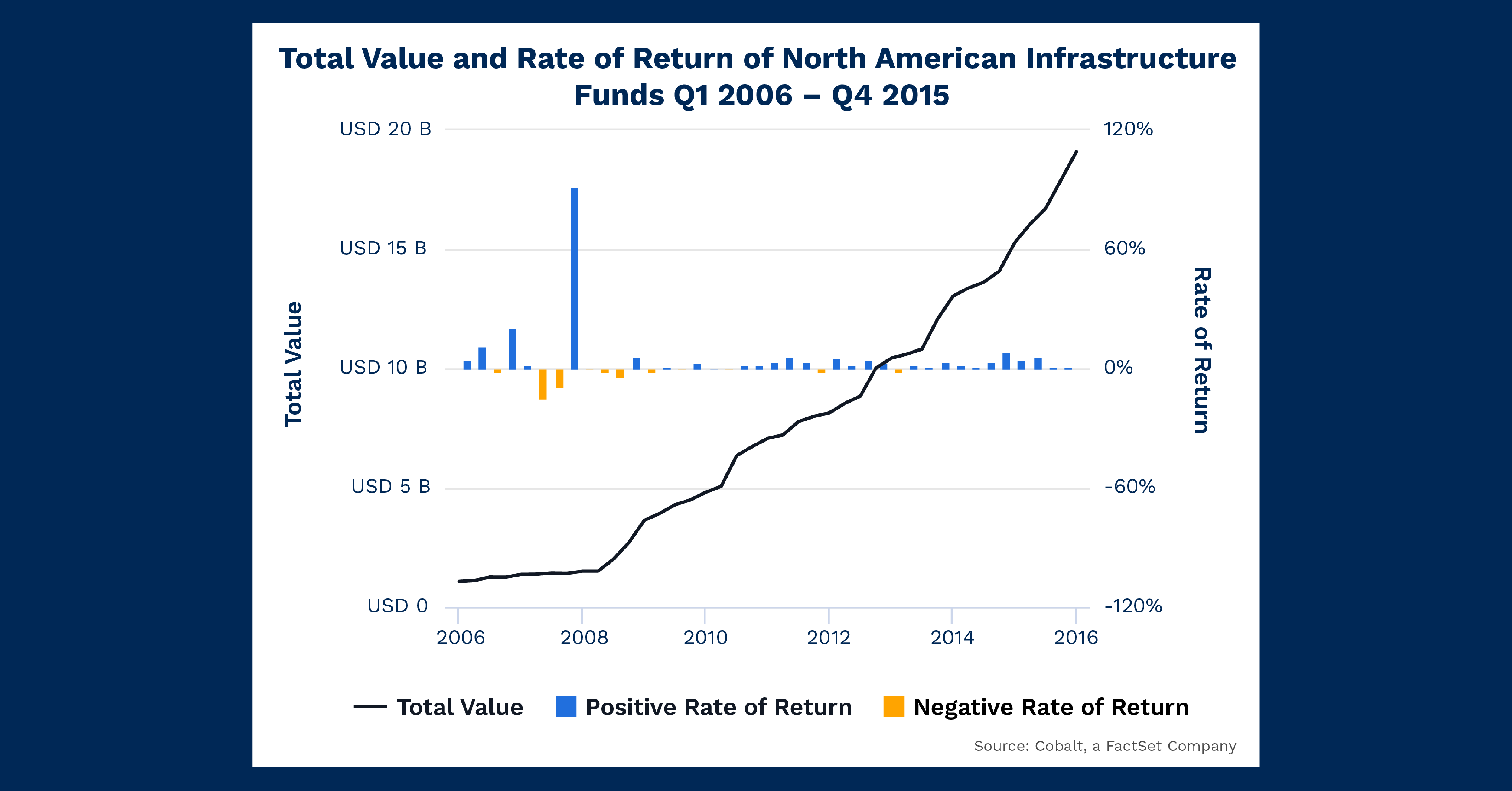
Infrastructure is a vertical we often analyze as it exists in a middle ground between mundanity and innovation. And the motivations for its investors can vary within that middle ground. We investigated infrastructure fundraising in 2021 and have had a nagging curiosity about the lone peak in 2008 fundraising ever since. The Great Financial Crisis tends to explain many trends around that time, but we looked deeper and charted the rate of return against the total net asset value (NAV) in North American Infrastructure investment to see if performance could be a driving component of the 2008 peak.
Key Takeaways
First, let’s look at the total value plot. We see an inflection point in Q2 2008 when the nearly flat curve of total NAV begins to increase at a rate that is sustained throughout the next decade. Indeed, our prior analysis confirmed this and showed sustained growth in infrastructure fundraising in the 2010s. The chart above gives us the “switch flip” moment to reveal how this upward trend changed rather quickly. Given this occurred in 2008, there is a myriad of possible explanations: a flight from credit and real estate to safer investments, an assumption that post-recession investment could consist of higher national infrastructure spending (both civil and energy), for example.
Secondly, let’s examine the rate of return plot. The returns are consistent and generally positive from 2006 to 2015. However, there are noticeably larger, positive returns in the lead–up to the inflection point in 2008. In 2006, the chart shows some large returns relative to the average, culminating in a massive return spike in 2007. Now, these are almost certainly products of sample size: single funds delivering outsized returns relative to a smaller population of funds in our database at that time. Regardless, the correlation is quite striking, and tempts one to postulate if fund managers at the time heard of the high individual returns and tried to pile into the space to capture excess return. This would inflate the NAV but flatten the returns as average performance decreased. Of course, the answer is likely a far more complex combination of factors.
Looking Ahead
While this chart analysis ends in 2015, it gives us insight into the potential direction of future investments. Today, infrastructure is still an expanding investment style, as energy diversification alone continues to pull more and more interest. And as infrastructure begets maintenance, investment can be a self-spending prophecy the more it increases.
From a performance perspective, we no longer see wildly outsized infrastructure returns like in the chart above. However, we still see strong and safe average performance from this style, implying the suppressed performance in the wake of the Great Financial Crisis may have been an anomaly.
Subscribe to our blog:

Is There Geographic Bias in Macro Liquidity Trends in Private Markets?
Is There Geographic Bias in Macro Liquidity Trends in Private Markets? Building on our previous analysis of the role of…

Private Equity Performance: Large Strategies Versus Funds of Funds, Co-Investments, and Secondaries
Private Equity Performance: Large Strategies Versus Funds of Funds, Co-Investments, and Secondaries In private equity, the large strategies of buyouts,…

Examining Tariff Policy Impacts on Private Fund Contribution Rates
Examining Tariff Policy Impacts on Private Fund Contribution Rates Recently we examined the impact of Latin America presidential elections—which carry presumptions…