blog

Comparing Public and Private Market Performance: Does Geography Matter?

November 21, 2024

Comparing Public and Private Market Performance: Does Geography Matter?

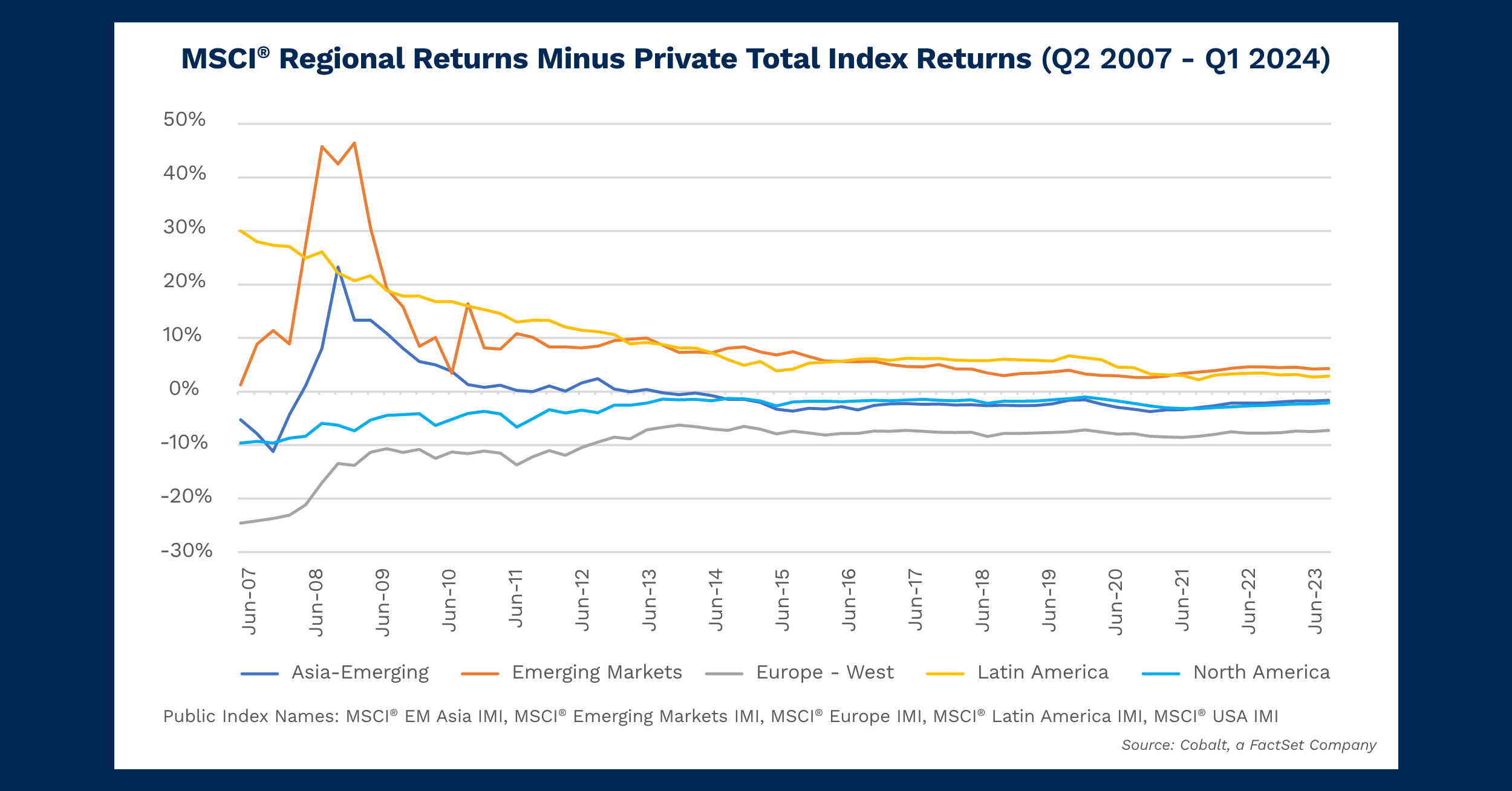
We’ve often analyzed various index returns in the public and private spheres over the years. For today’s analysis, we have augmented our approach to visualize the role of geographies in the variance between public and private market performance.

Given the robust data available, we selected Asia-Emerging, Emerging Markets, Europe-West, Latin America, and North America from the MSCI regional indexes on our platform. The analysis timeframe starts in 2007 so that you can also see the variance of returns after the Great Financial Crisis. Overall, there are several trends to examine.


Key Takeaways

All markets have ultimately trended toward the 0% variance line because of the cumulative effect of the performance numbers over time. The high variance in early years of our 2007 – 2024 sample period reflects a fair amount of noise in the data. However, as the data in our analysis reflects total returns over time, the equilibrium values in the later years are more accurate compared to the initial chart noise.

For 2024:

  • The positive indexes are Latin America and Emerging Markets with a delta of around 3% and 4%, respectively. That indicates a higher return for the public market compared to the private market. This is likely due to a high loss ratio, and low internal rates of return among those private markets during our sample time period, buoying otherwise normal public market values.
  • The negative index is Europe-West with a delta of around -7%, indicating a higher private than public market return. This is likely due to the stagnant public market returns of the region in the past 10 years combined with above average private market returns—especially a significant group that generated returns above 15%.
  • The near-zero indexes are Asia-Emerging and North America with a delta of around -2%, indicating a slightly higher private than public market return. In both cases this is driven by high public and private market returns, with the disparity between the two likely driven from the illiquidity premium that private investment offers.

Looking Ahead

While this dataset covers total returns and therefore is not predictive of future public/private disparity in performance, it does show some overall trends on which geographies have tended to outperform in their public vs. private spheres.

Many of these trends are locked in: 4 of the 5 have always been positive or negative, with one, Asia-Emerging, having flipped between the two. It’s an interesting trend to follow as investment in private funds in China has likely overtaken public investment as the country’s public rate of return has slowed to other developed-market economy levels.

Furthermore, other select emerging markets may see a similar reversal, with their private markets beginning to outperform the public ones as their economies also stabilize and more robust pathways of private investment appear.


This blog post is for informational purposes only. The information contained in this blog post is not legal, tax, or investment advice. FactSet does not endorse or recommend any investments and assumes no liability for any consequence relating directly or indirectly to any action or inaction taken based on the information contained in this article.
blog

Changing Fortunes: Tracking 20 Years of Returns Across Credit and Venture Capital

October 14, 2024

Changing Fortunes: Tracking 20 Years of Returns Across Credit and Venture Capital 

Last month, the Federal Reserve announced its first cut to interest rates in over four years. This is expected to be followed by more cuts into early next year, reversing the trend of increasing rates throughout the 2020s.  

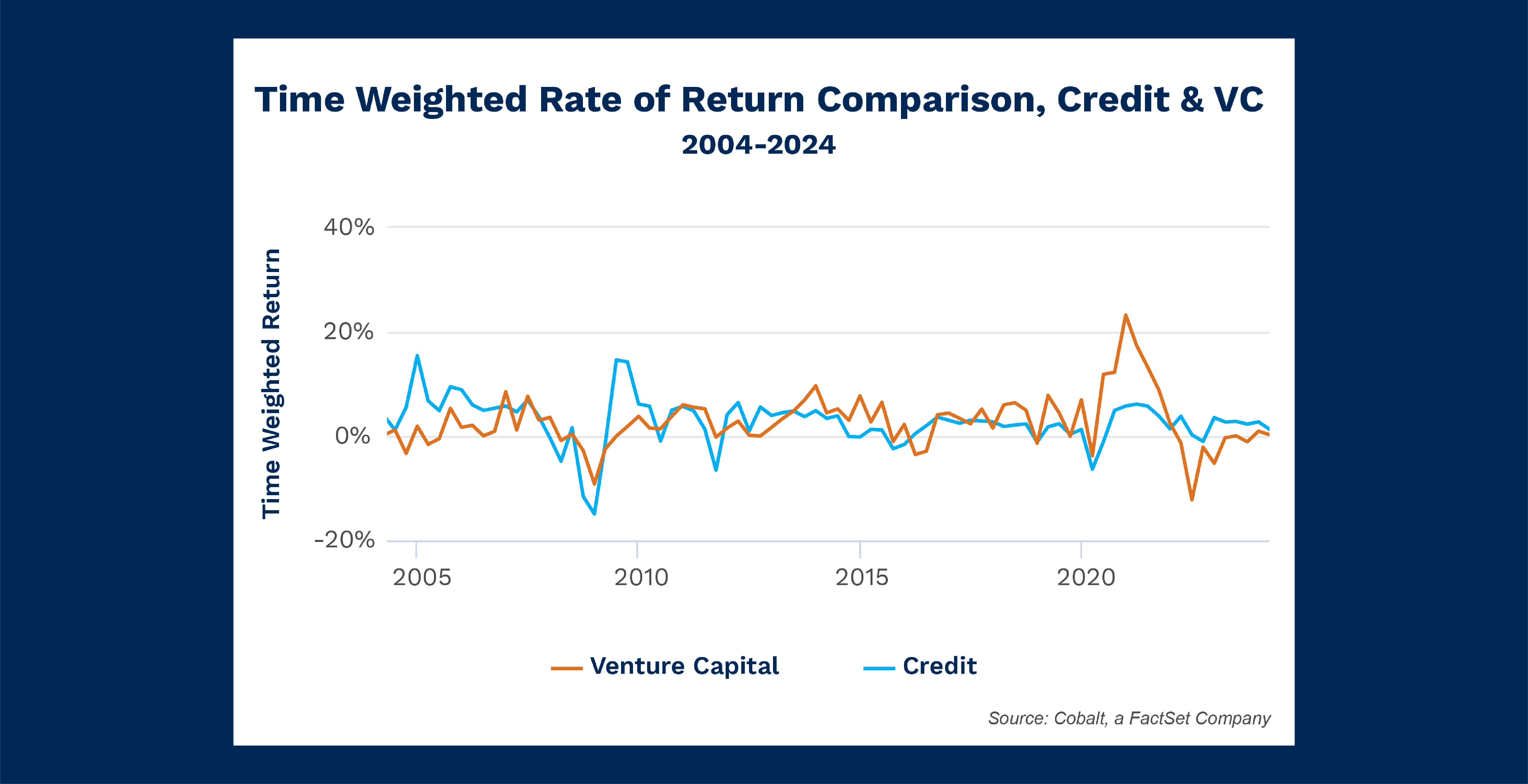
With this in mind, we analyzed the returns of credit investments in our dataset and noted how it tracks through different policy adjustments and environments. For the analysis, we pulled the Credit Time Weighted Rate of Return (TWRR) and included the same metric for venture capital. VC offers a good counterpoint to credit, as they have different risk profiles that would be expected to behave different under various macro stressors such as inflation and high-growth environments, for example. 

Key Takeaways

As anticipated, VC and credit offer many different quarters and periods of divergence over the past 20 years. This is a helpful pairing to highlight how different environments effect credit.   

Conversely, credit much more closely follows a strategy like buyouts. In fact, over the 20-year sample period, credit and buyout returns were within 1% of each other for 23 quarters, or 28% of the time. This level of similarity created a pattern where the dips and recoveries very closely mirrored themselves across different macro environments. 

The last two recessions best illustrate how the macro climate can shape performance among these strategies in different ways. Coming out of the global financial crisis, credit experienced four quarters of outsized returns, benefiting from undervalued distressed assets. Meanwhile, venture rebounded as well, but more mildly, as the recovery from the crisis was less conducive to startups and tech. 

The roles were reversed at the start of the 2020s, as VC experienced sharp recovery from the COVID bottom-out. Fueled by cheap money in a low-rate environment, VC had seven quarters of market-beating returns, but has been mired in two years of underperformance as inflation and a tightening economy took control.  

Conversely, credit didn’t experience the peak performance through the end of 2020, but it has steadily produced returns in recovery and outperformed VC since Q1 2022, with a more beneficial high-rate environment and less of an impact from large-scale events like the bank failures of 2023. 

Looking Ahead

Outside of a roughly five-year window at the end of the 2000s, credit has been the more consistent strategy quarter-over-quarter dating back to 1995 when our dataset starts. With this track record, we expect that trend to continue holding through the rest of the 2020s. 

This may hold true even as rates are cut, which historically has been a boon for VC returns. If this leads to outsized returns a few quarters down the road for the strategy, we still expect the quarterly consistency to remain on credit’s performance.


This blog post is for informational purposes only. The information contained in this blog post is not legal, tax, or investment advice. FactSet does not endorse or recommend any investments and assumes no liability for any consequence relating directly or indirectly to any action or inaction taken based on the information contained in this article.
blog

Introducing Cobalt Comment Threading

October 3, 2024

Say hello to streamlined Portfolio Company communication, and goodbye to notification overload.

Whether you manage tens or hundreds of portfolio companies, your team requests and collects an overwhelming amount of data from your PortCos regularly.

All those requests mean a lot of manual effort to make sure you capture any changes to that data, keep up on reporting, and don’t miss critical context requiring your attention in the bigger shuffle.

That’s where Cobalt comes in: our new Comment Threading ensures you never miss an important notification.


Here’s how it works:


With Cobalt Comment Threading, your team can prioritize and stay focused on critical tasks, act quickly on information that needs their attention, and clearly track communication throughout the portfolio company data collection process.  

  • Save time during the data collection process  
  • Manage notifications and alerts  
  • Quickly act on information that needs attention  
  • Track all PortCo communication

Interested in seeing how Cobalt Comment Threading works? Request a full demo with our team below.

Request a Demo:

blog

Measuring Momentary Impacts of Latin America Presidential Elections on Public and Private Markets

September 17, 2024

Measuring Momentary Impacts of Latin America Presidential Elections on Public and Private Markets

Investors often look at the future economic policies of presidential candidates to forecast public versus private market elevation. Latin America has had many recent presidential elections that give us a quality sample size to analyze if a connection exists.  

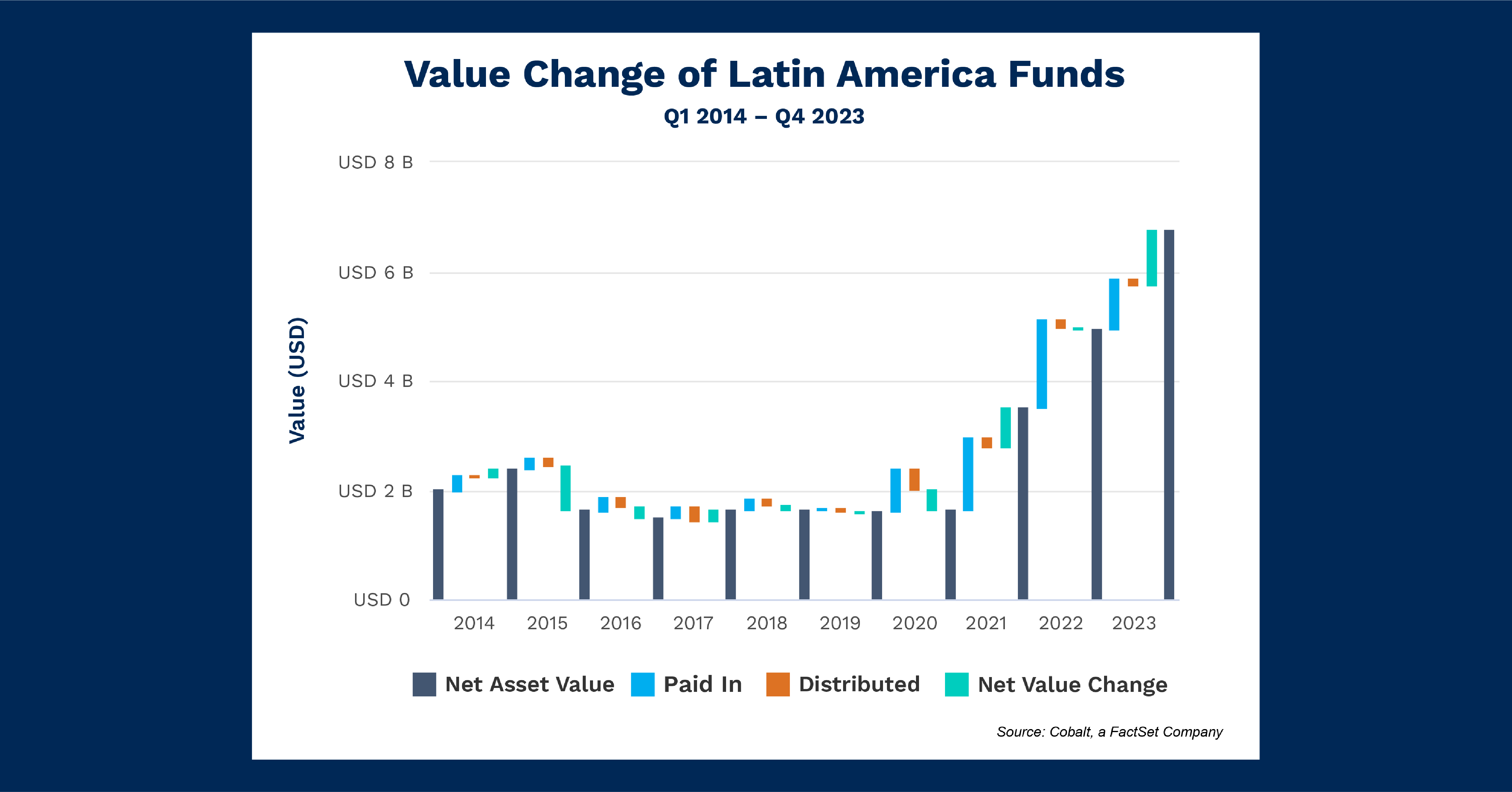
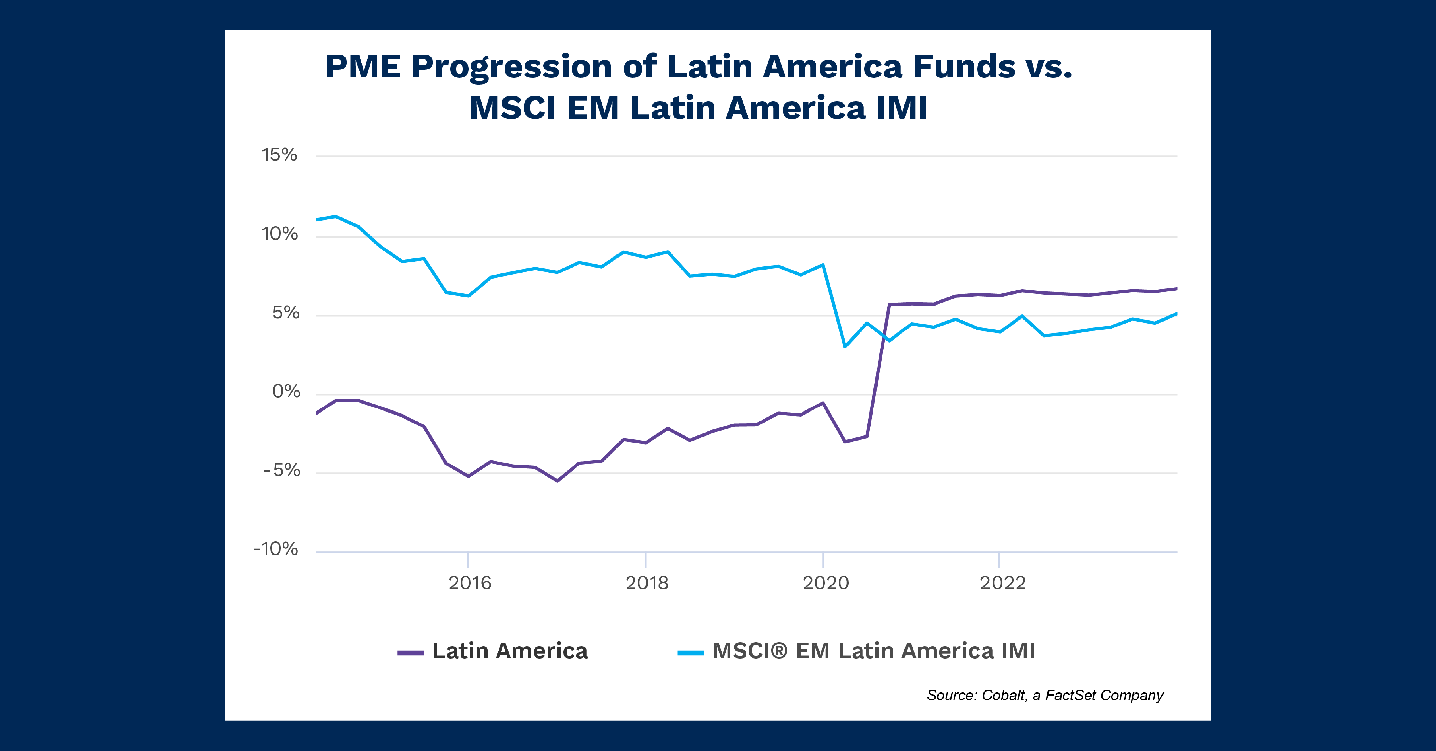
The charts below represent a portfolio of Latin America fund performance. We display both value change and return to capture private markets and placed that against the overall public market return for the region to discern potential correlation to a public market effect. 

Key Takeaways

To establish the list of elections we looked at Brazil (Q4 2018, 2022), Mexico (Q3 2018, 2024), Argentina (Q4 2015, 2019, 2023), and Colombia (Q2 2018, 2022). As the four largest economies in Latin America, they comprise the majority of private investment interest within our dataset. 

Q4 2016 – Q1 2017 saw significant contributions, and Q1 2023 saw significant distributions. While a change in power did occur in Brazil in Q4 2016, it was mired in weak sentiment and was unlikely to have lifted investment interest. Q1 2023 also does not coincide with any election, and therefore may instead reflect the eventual distribution of funds invested in 2020 given how three years of the highly profitable deep-value investments of 2020 may have begun to pay off. 

Q3 2020 delivered a reversal of the private and public market returns as the private market return jumped from a negative to around 5%, while the public market returns dropped from around 8% to 3% over the same time period. This doesn’t seem to correlate with any of the election timelines. It could easily be a combination of public market drawdowns from pandemic shutdowns combined with large returns from a small group of funds floating the private market returns. 

Looking Ahead

Late July saw a heavily scrutinized election in Venezuela: A country that has historically had significant impact on oil pricing, but a smaller overall economy. This will likely have significant effects on local markets, but it’s too soon to evaluate if the election will impact investment interest at a regional level. Overall, however, our analysis within Cobalt’s market data set tells us it’s difficult to predict the impact of presidential results on public or private markets above the level of mere market noise.  


This blog post is for informational purposes only. The information contained in this blog post is not legal, tax, or investment advice. FactSet does not endorse or recommend any investments and assumes no liability for any consequence relating directly or indirectly to any action or inaction taken based on the information contained in this article.
blog

Going for Gold: Assessing the Strongest Investment Strategies In Western Europe

August 9, 2024

Going for Gold: Assessing the Strongest Investment Strategies In Western Europe

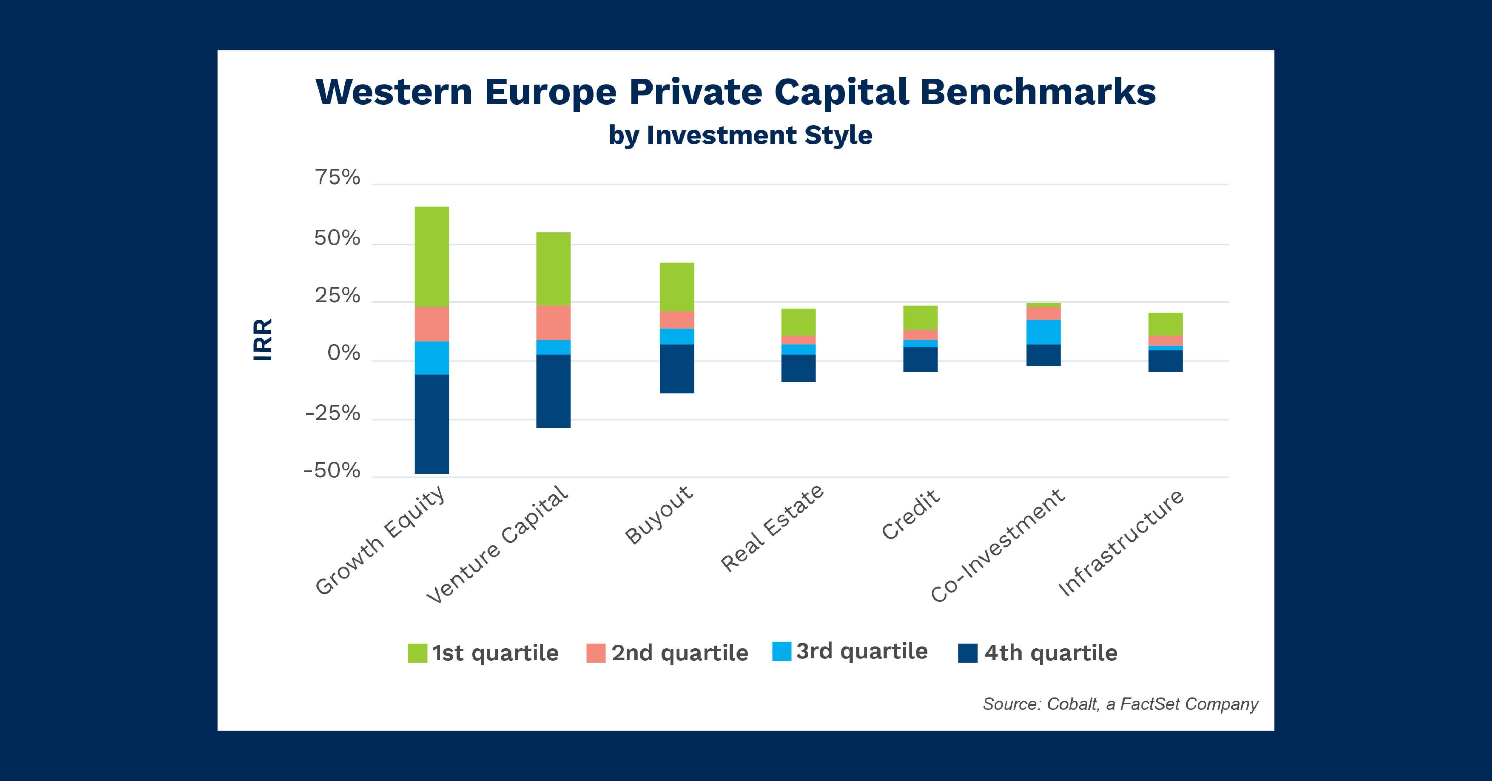
With the eyes of the world on Paris for the Olympic Games, we wanted to identify the topperforming strategies in France’s geographic profile, Western Europe, and award some medals of our own. To best assess the overall performance of each strategy, the top-line performance along with underperformance and downside, we review the quartile benchmarks for the seven main investment styles in the region. 

Key Takeaways

Among the seven strategies there are three standouts: buyout, venture capital, and growth equity. At first glance, growth equity is the top performer with the highest upper fence at 22% (or the percent at which any fund above it could be considered an outlier within the dataset). Venture capital (VC) would appear second, but it has a higher top-quartile cutoff at 23%. This, paired with a better lower fence (denoting less downside risk) means we would place VC slightly ahead of growth equity for the gold medal in Western Europe.  

Buyout funds lack the top-level performance of the other two but make up for it with a third quartile breakpoint of 6.4%, much higher than VC and growth. This positions buyouts as having a bit less upside, but steady returns for at least three-quarters of funds in the region make it a clear case for the bronze medal. 

The other strategies take the benchmark pattern of buyouts a step further. Although they have considerably less upside from the top-performing quartile, they have a higher floor with all lower fences for these strategies falling above -10%. The sturdiness of these investments and the smaller spread of likely outcomes provide slightly more certainty to these strategies compared to the top performers. 

Looking Ahead

Although venture capital has won the gold, the changing macro-environment may have an outsized effect on the private markets in the years to come.  

With economic indicators such as inflation and the CPI normalizing over 2024 after the rockier preceding years, there may be a rising tide that lifts all strategies to healthier returns in the back half of the 2020s. 


This blog post is for informational purposes only. The information contained in this blog post is not legal, tax, or investment advice. FactSet does not endorse or recommend any investments and assumes no liability for any consequence relating directly or indirectly to any action or inaction taken based on the information contained in this article.
blog

Tracking Private Market Investments in Natural Resources Through the Evolving Regulatory Environment

August 6, 2024

Tracking Private Market Investments in Natural Resources Through the Evolving Regulatory Environment

Recent months have seen temperatures rise between Exxon and large institutional LPs, namely CalPERS. The conversations are centered around board member votes and, more broadly, shareholder rights. While these factors don’t directly impact our Cobalt dataset, it’s a timely opportunity to analyze our LP base portfolio allocations to Natural Resource.  

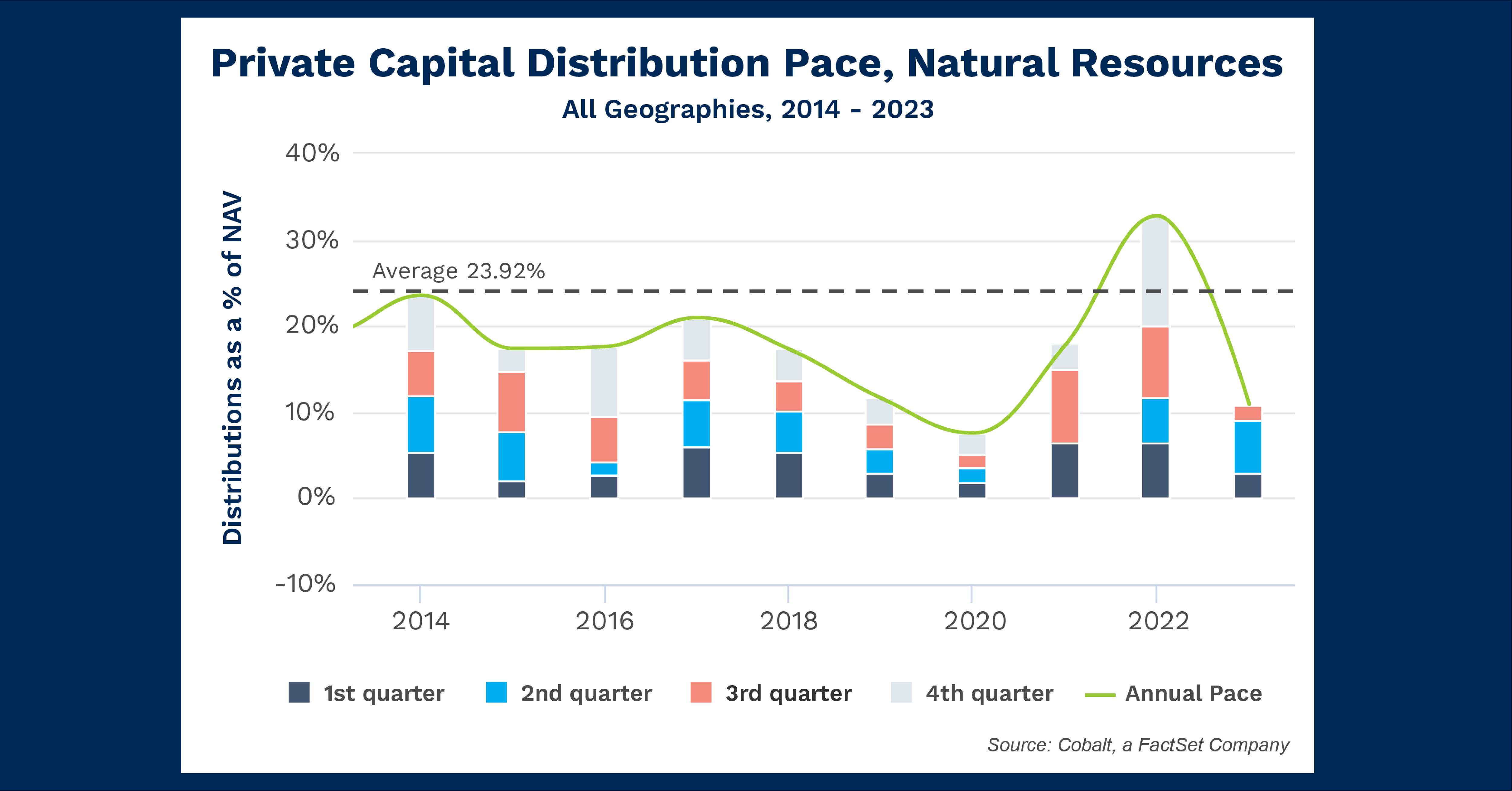
For the analysis, we focus on the pace at which distributions are being made in that strategy across all geographies over the last 10 years. (distribution pace = distributions as a % of NAV). 

Key Takeaways

The most evident trend in the chart is the steady downward trajectory throughout the 2020s, from a high of 23.5% in 2014 to the low of 11.6% in 2019. This mirrors the trend in the public markets in that timeframe, with the S&P Global Natural Resource Index peaking over 2900 in 2014 compared to a high of only 2500 throughout 2019. This reinforces that Natural Resource saw decreasing fortunes through the decade, even as many other industries thrived. 

This trend continued to an even larger extent into 2020, with only 7.6% pacing throughout the year, the lowest since 2009. As COVID greatly impacted all markets earlier in that year, Natural Resources continued to struggle in the latter half as well with each individual quarter all returning < 2.5%.  

The span of 2021 – 2022 proved to be a strong bounce-back period, with 2022 returning a high of 32.8% in the timeframe. Although 2023 isn’t quite on pace to match that recent strong form, it should reach roughly 14% – 18% depending on the final Q4 numbers. That would fall in line with many of the average years of the 2010s.   

Looking Ahead

The Natural Resource Index saw 3.7% growth in Q4 2023, so while not a 1-to-1 comparison to the trends seen over the past decade, this is a sign we may see a healthy Q4 posted once numbers are finalized. The same index has also seen a strong 2024 thus far, so we should continue to see the 2020 dip in the above chart as an outlier in an otherwise strong recovery from the downturn throughout the 2010’s.  

The questions raised by this conflict will be interesting ones to monitor throughout the decade. The dynamic between LPs and large companies when it comes to investment horizons and ESG policies will continue to play out and have large impacts on these investments moving forward. 


This blog post is for informational purposes only. The information contained in this blog post is not legal, tax, or investment advice. FactSet does not endorse or recommend any investments and assumes no liability for any consequence relating directly or indirectly to any action or inaction taken based on the information contained in this article.
blog

Chart of the Month: June 2024

June 24, 2024

Silicon Safari: Examining the Trajectory of Sub-Saharan Investment Trends

In May, the US hosted Kenya President William Ruto as part of a diplomatic effort with the Sub-Saharan Africa nation. Much of the focus was on the economic relationship and potential partnership for investing in areas such as technology startups in Kenya’s “Silicon Savannah” or sharing funding from the CHIPS Act.

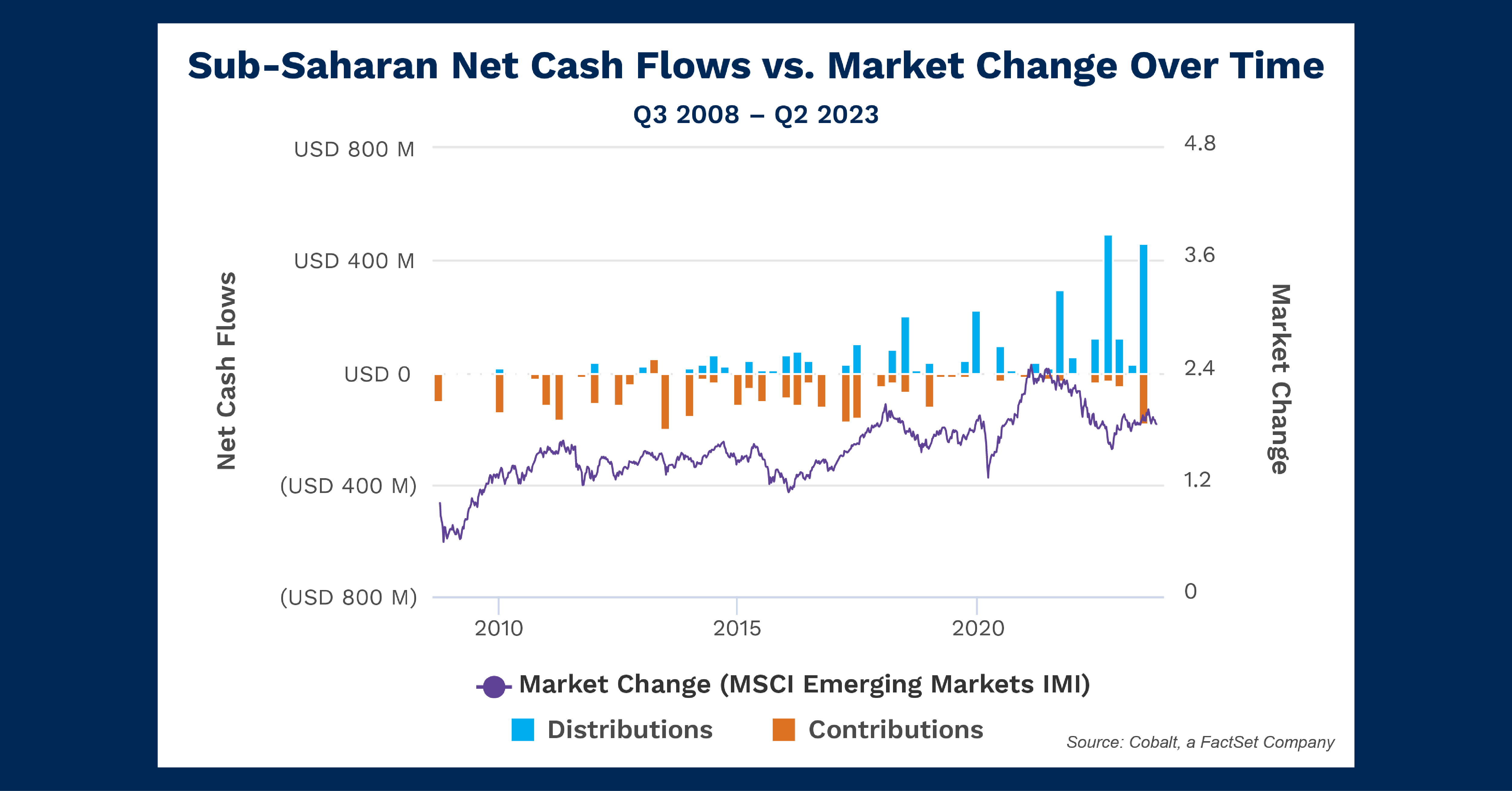
Building upon our previous analysis of emerging market investment, in this article we’re investigating investment interest and returns so far in the region. The chart below shows the levels of contributions and distributions over the past 15 years, overlaid with a comparable index (MSCI Emerging Markets IMI) to show regional performance in the public markets.

Key Takeaways

While the relatively small size of the sub-Saharan private market means there will be lower volumes of cash flows to measure, we see a pattern of fairly low but consistent contributions from 2010 to 2020. After 2020, the contributions largely drop off except for a return to form in 2023. This is a result of a small sample size, largely concentrated in funds raised in the early to mid-2010s. When these funds were fully contributed by 2020, the contributions dropped off, with newer funds beginning to show up in 2023. Overall, it indicates a stable but low level of interest in investment.

On the other hand, the distributions tell a different story. As expected, the distributions slowly begin about three years after contributions had initiated. However, they proceeded to slowly build over the time period observed, ending at several multiples of the highest contribution levels. This and the choppy-but-consistent slow growth of the emerging market sector shows there are returns to be had—even with the small sample—and there may be room for increased investment.

Looking Ahead

In light of this news of greater investment into the region, investors will likely pay more attention to the Kenyan tech sector. And that interest could certainly spread into Ghana and Nigeria in West Africa, which have shown strong growth in population and tech capacity.

What remains to be seen is whether the sparse-but tangible returns the private sector has seen over the past 15 years are indicative of future capacity—or whether expanding the sample size will show a market no more remarkable than any other.


This blog post is for informational purposes only. The information contained in this blog post is not legal, tax, or investment advice. FactSet does not endorse or recommend any investments and assumes no liability for any consequence relating directly or indirectly to any action or inaction taken based on the information contained in this article.
blog

How Five Points Capital Assesses the Exposure and Returns of a Complex Portfolio with Cobalt Portfolio Monitoring

June 24, 2024

CLIENT CASE STUDY


How Five Points Capital Gained Efficiency and Accuracy with Cobalt

In this case study, Patrick O’Rourke, Vice President of Strategy & Operations at Five Points Capital, discusses how Cobalt’s portfolio monitoring platform enabled streamlined data ingestion and automatic report generation for his firm, boosting his team’s accuracy and saving days of tedious data entry each quarter. 

Partnering with Cobalt empowered Five Points Capital to:

  • Realize real-time cash flow tracking
  • Gain flexible access to data and automate report generation
  • Leverage data creatively and tailor engaging presentations for investor meetings


Download the Case Study

blog

Chart of the Month: May 2024

May 20, 2024

Derivative Charts: Plotting the Growth of the Alternatives Market

Following up on last month’s chart and the exploration of our off-platform data capabilities, we exported the popular NAV and dry powder chart data to determine the quarter-by-quarter NAV growth of the Global Alternatives market.

Key Takeaways

Though presented in a different manner, our quarterly NAV growth chart tells a similar story to our Cobalt base analytics, with the negative downturns of the early and late 2000s and 2020 prominently displayed. Overall, it is still a growth story: Only 18 of the 96 sample quarters showed zero or negative growth, and the total NAV averaged 5% quarterly growth over the sample period.

The period from Q4 2002 to Q3 2008 is exemplary as the longest stretch of continued quarterly growth. It was a transition period for the private capital industry, when discussing the size of the alternatives market jumped to trillions from billions. Paired with a fruitful climate that led to organic NAV growth between the dot com bubble and the Great Financial Crisis, the half-decade of sustained growth is readily explained.

Naturally, as the market has ballooned to astronomical heights, the peaks of growth seen in the earlier days of our tracked data (near 30% growth in the quarters of the late 90s) are harder to come by. You’ll see that in the chart in the down-and-to-the-right shape of the highest growth quarters over time, with much more needed today to grow a multi-trillion-dollar pie.

Looking Ahead

Barring an impact like that of COVID in Q1 2020, we believe the tightening of growth is likely to continue. This would mean consistent quarters of single-digit growth with the occasional negative quarter.

If LPs continue to reconsider portfolio construction and commit a larger percentage to alternatives, this may act as a buoy for the market to maintain its growth regardless of other macro factors that could prompt a downturn.


This blog post is for informational purposes only. The information contained in this blog post is not legal, tax, or investment advice. FactSet does not endorse or recommend any investments and assumes no liability for any consequence relating directly or indirectly to any action or inaction taken based on the information contained in this article.
blog

Chart of the Month: April 2024

April 19, 2024

Surge Pricing: Examining the Ability to Adjust North America Infrastructure Investing on a Short Timeline

The state of Infrastructure investing in America has been an often-criticized topicIn addition to wear and tear, sudden and catastrophic damage is a real danger to both the logistical integrity of our economy, and the lives of those who need to use these facilities every day.  While we often look at infrastructure investing, considering recent sudden damage such as the Francis Scott Key bridge collapse, or the elevated hurricane levels predicted for this year’s Atlantic coastline, this time we wanted to look at the investors’ potential impulse contribution level: how fast investment could shift at a private level to respond to demands for greater infrastructure investing. The next few months we will be testing out expanding beyond our in-app Cobalt Analytics to leverage the dataset capabilities out of the platform As such, we put together a portfolio of North America Infrastructure funds and exported the data to create the above visualizationThe goal is to see how flexible investment contributions have been over the past 5 years on a quarterly basis.

Key Takeaways

Looking back to the beginning of our charts, we see a low sustained level of contribution: hovering between $1B and $2B per quarter.  The primary driver of growth quarter over quarter is clearly coming from LP investment.  This is a strong rate of investment, with usually positive NAV growth statistics contributing to slow and steady expansion over time.  This market clearly accommodates noise with its fluctuations in contribution levels but seems to mean revert and hold a steady state rate of investment. 

This changes as we move forward in the chartLooking to Q3 2021, we see a rapid increase in investment level, with no clear new mean level of supportThe timing here coincides with the passage of the Infrastructure Investment and Jobs Act, thus either leading to a rapid expansion in infrastructure investment interest, or an expansion in the universe of infrastructure investment opportunities.  Regardless, assuming this trend is a going concern, the result is that available funding for infrastructure has expanded as is flexibly investible on a quarterly basis: able to go up one quarter, and down the next. 

Looking Ahead

Given the greater investment capacity of the last few years, there is a good chance that the capacity for a surge of investing towards infrastructure needs does existThe main holdup would be the investor appetite for immediate change, and whether projected returns on such short-term scoping can sufficiently attract these surges to keep pace as America’s need for further infrastructure investing increases. 


This blog post is for informational purposes only. The information contained in this blog post is not legal, tax, or investment advice. FactSet does not endorse or recommend any investments and assumes no liability for any consequence relating directly or indirectly to any action or inaction taken based on the information contained in this article.