Is There Geographic Bias in Macro Liquidity Trends in Private Markets?
Is There Geographic Bias in Macro Liquidity Trends in Private Markets?
Building on our previous analysis of the role of geographies in the variance between public vs. private market performance, we now take a look at both contribution and distribution rates.
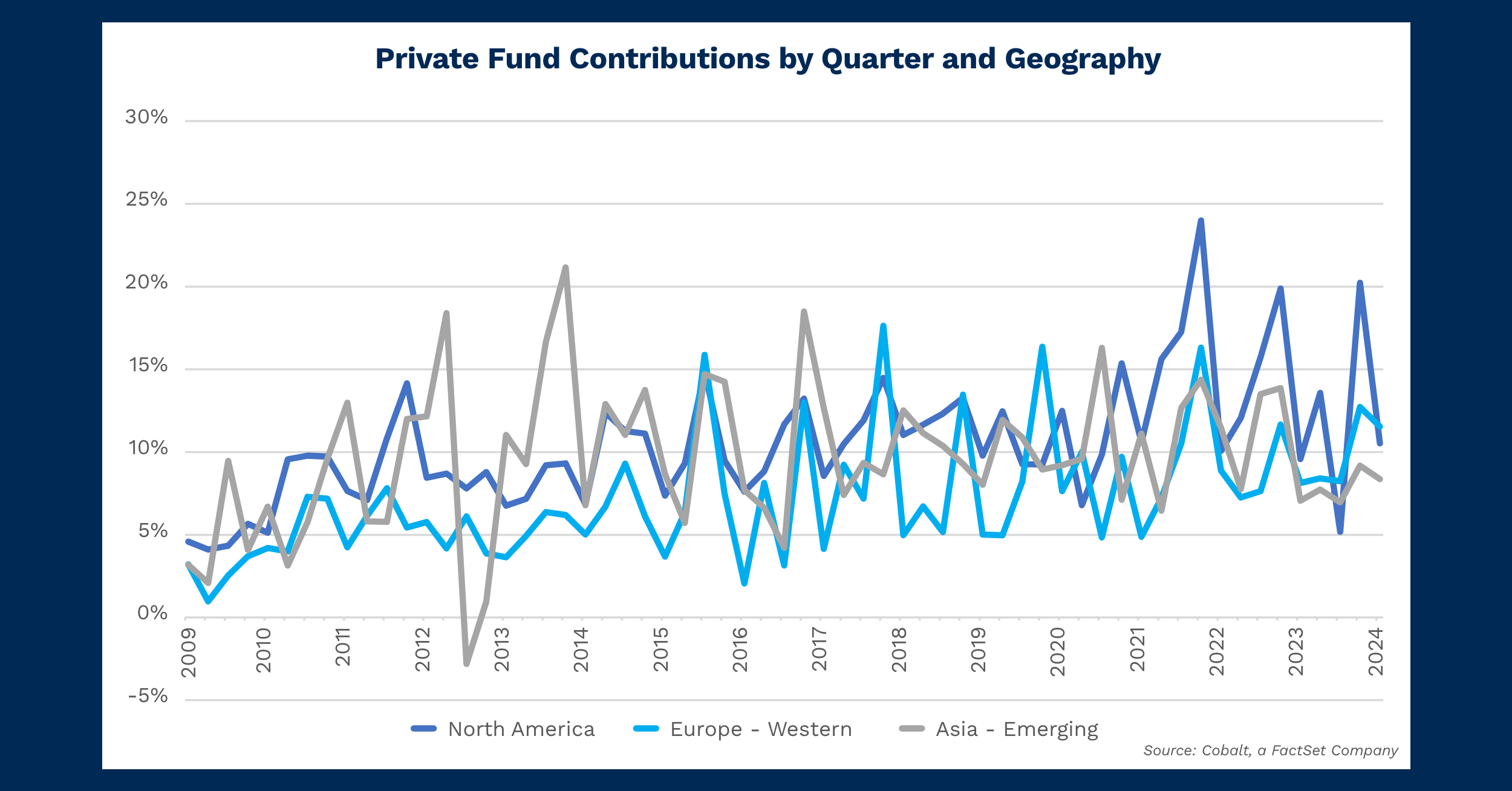
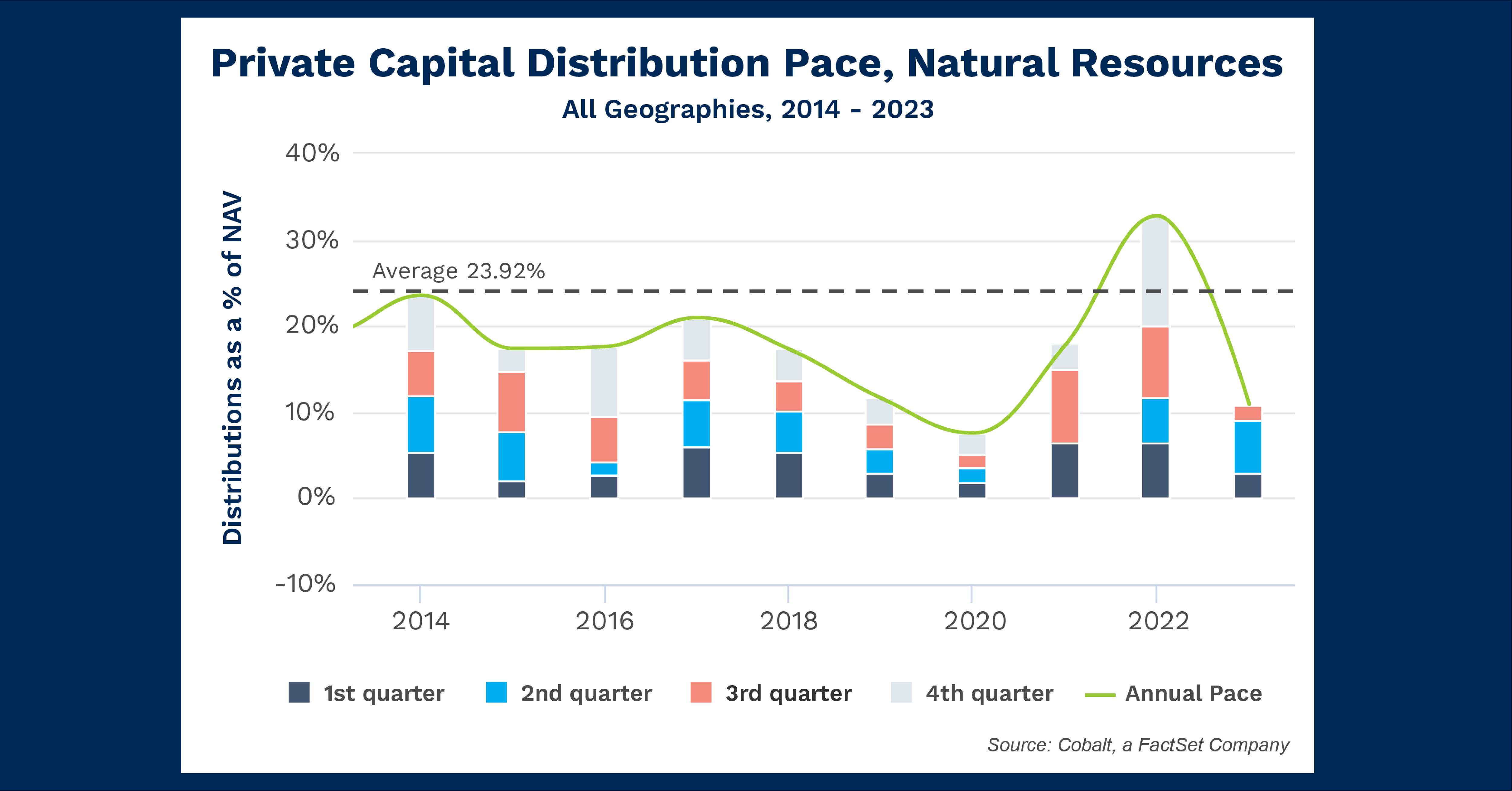
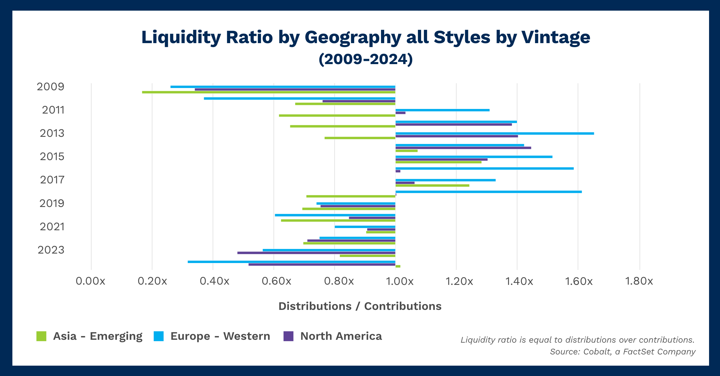
While contribution rates are a proxy for investment interest, adding distribution rates to the mix can better explain how fund payoffs may affect investment levels. As illustrated in the following chart, we examined the three biggest geographies—North America, Western Europe, and Emerging Asia—to explore whether trends emerge geographically or whether investor interest is region agnostic.
Key Takeaways
We see clear periods of high relative distributions and high relative contributions. Contribution-heavy periods are more common, which makes sense given the private space is expansionary and distributions from outperformance and underperformance of funds are partially offsetting factors. Distribution-heavy periods tend to begin about three years after a recession, likely due to deep value investments in that period paying off high multiples.
Analyzing how the geographies switch between distribution and contribution regimes, there is inconsistent smoothness. European investments seem to swap between contribution and payoff periods with little transition, while American and (more recently) Asian investments gradually transition between the two as we see in two periods: 2010 – 2011 and 2018 – 2019.
That seems to indicate those markets are less macro influenced with investing interest being relatively constant. The long period of distribution-heavy years in the 2010s is likely derived from the easy money run of the post-2008 economy.
Leading and lagging is the last factor we observe in this data: European and American investments transition more quickly than Asian investment levels for most of the timeline (2001-2018).
However, since 2018 there has been a decoupling as interest in American and European investments seems to be deepening compared to the payoffs of those regions. The Asian markets appear to be trending toward a payoff period, similar to the deep value investments in the 2020s payoff. The other markets seem to have experienced a payoff period in 2021 as markets rebounded.
Looking Ahead
Expanding on the previous point, Asian markets (largely driven by China) appear to be heading toward net positive distributions as funds from 2020 pay off. From here, continued economic strength could lead the region to experience more distributions above contributions, though that scenario will likely revert over time as returns normalize and contributions continue to rise.
On the other hand, European and American investment contributions are rising compared to distributions, potentially signaling a falloff in returns from private investment. That could slow additional investment. Alternatively, it could just be steadily increasing contributions with flat returns leading to a deepening contribution deficit.
Subscribe to our blog:

Private Equity Performance: Large Strategies Versus Funds of Funds, Co-Investments, and Secondaries
Private Equity Performance: Large Strategies Versus Funds of Funds, Co-Investments, and Secondaries In private equity, the large strategies of buyouts,…

Examining Tariff Policy Impacts on Private Fund Contribution Rates
Examining Tariff Policy Impacts on Private Fund Contribution Rates Recently we examined the impact of Latin America presidential elections—which carry presumptions…

Comparing Public and Private Market Performance: Does Geography Matter?
Comparing Public and Private Market Performance: Does Geography Matter? We’ve often analyzed various index returns in the public and private…