blog

Chart of the Month: June 2023

June 14, 2023

The Bridesmaid: Secondary Liquidity Investment Trends from 1999-2022 

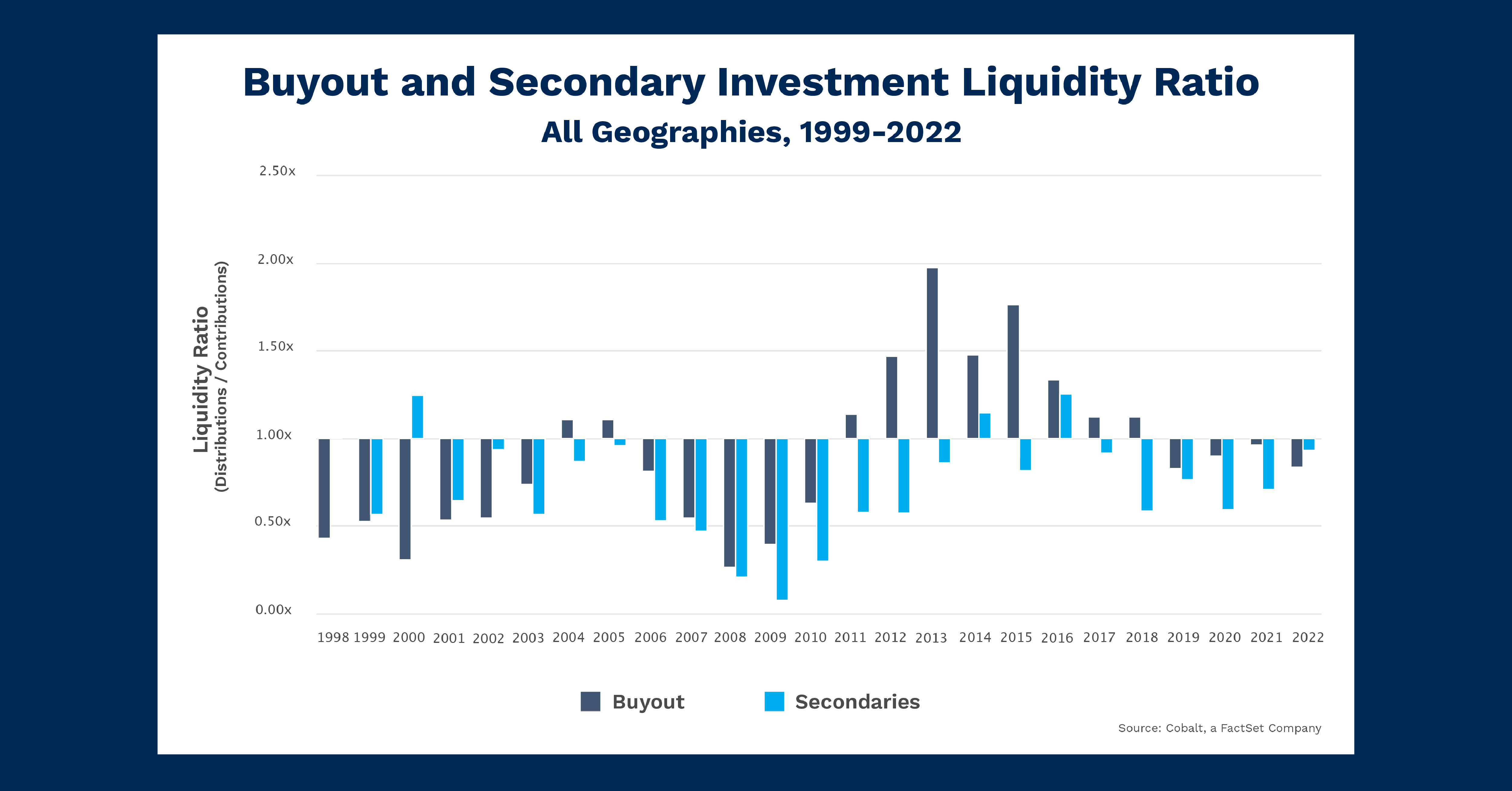
Wedding season is in full swing, and as many are searching for cheap suits and flights, we’ve looked at an alwaysinvestedin butneverobsessed over style: Secondaries. To gauge investor interest and cyclicality, we used Cobalt market data to compile the distributions and contributions in the secondary fund universe against buyout funds (which we feel is representative of the overall private market trend). This analysis gives a sizeagnostic sense of how investors pay in, and how they are paid out for their choices. 

Key Takeaways

To start, let’s dive into buyout fund liquidity over time. This is representative of the general liquidity cycle of private markets over the past 20 years. Most mainstream strategies (excluding Secondaries, Infrastructure, and Natural Resources) follow the pattern in the chart above. The overall private market investment cycle is characterized by higher contributions during and following recessionary events (2000-2003, 2007-2010) and higher distributions immediately after the recovery (2004-2005, 2011-2018). This implies a cyclical approach to private market investments. Investor interest is counter-cyclical, with investment surges resulting in payoff surges about five years later when the funds begin distributing. 

So, why and how do secondary funds break the overall private market trend? As seen in the chart, Secondaries roughly follow the same pattern of investing during economic downturns (with more distributions coming out of these downturns), but the scale of distributions is heavily muted compared to the benchmark.  

One explanation for this is the scope of secondary investing trending upwards, with NAVs increasing since 2006. Total secondary fundraising in the 2000s was only $85B, compared to $335B in the 2010s. As a result, the significance of $2B excess contributions is much greater in 2008 when total contributions and distributions are around $3B. Conversely, in 2013 $2B excess distributions are compared to more than $12B total. The result is the diminution of the liquidity ratios following the 2008 recession seen in the chart above. 

Looking Ahead

It’s clear that secondary funds have been a popular investment strategy amidst the Covid-era drawdown. This is in line with the broader market, but combined with rising NAVs proportionate to contributions we could anticipate another disruption of the cyclical pop as distributions will be paid out in the coming years. This will likely be overshadowed by the volume of investment, yielding a “surprisingly” subdued liquidity ratio. 

However, apart from appearances, this does not reflect the investment style performance and the ability to generate returns, as the increasing popularity is reflective of Secondary’s relatively similar performance to the rest of the private markets. 

This blog post is for informational purposes only. The information contained in this blog post is not legal, tax, or investment advice. FactSet does not endorse or recommend any investments and assumes no liability for any consequence relating directly or indirectly to any action or inaction taken based on the information contained in this article.
blog

Chart of the Month: May 2023

May 3, 2023

Through the Grapevine: A Hypothesis in North American Infrastructure Trends Q1 2006-Q4 2015

Infrastructure is a vertical we often analyze as it exists in a middle ground between mundanity and innovation. And the motivations for its investors can vary within that middle ground. We investigated infrastructure fundraising in 2021 and have had a nagging curiosity about the lone peak in 2008 fundraising ever since. The Great Financial Crisis tends to explain many trends around that time, but we looked deeper and charted the rate of return against the total net asset value (NAV) in North American Infrastructure investment to see if performance could be a driving component of the 2008 peak. 

Key Takeaways

First, let’s look at the total value plot. We see an inflection point in Q2 2008 when the nearly flat curve of total NAV begins to increase at a rate that is sustained throughout the next decade. Indeed, our prior analysis confirmed this and showed sustained growth in infrastructure fundraising in the 2010s. The chart above gives us the “switch flip” moment to reveal how this upward trend changed rather quickly. Given this occurred in 2008, there is a myriad of possible explanations: a flight from credit and real estate to safer investments, an assumption that post-recession investment could consist of higher national infrastructure spending (both civil and energy), for example. 

Secondly, let’s examine the rate of return plot. The returns are consistent and generally positive from 2006 to 2015. However, there are noticeably larger, positive returns in the leadup to the inflection point in 2008. In 2006, the chart shows some large returns relative to the average, culminating in a massive return spike in 2007. Now, these are almost certainly products of sample size: single funds delivering outsized returns relative to a smaller population of funds in our database at that time. Regardless, the correlation is quite striking, and tempts one to postulate if fund managers at the time heard of the high individual returns and tried to pile into the space to capture excess return. This would inflate the NAV but flatten the returns as average performance decreased. Of course, the answer is likely a far more complex combination of factors. 

Looking Ahead

While this chart analysis ends in 2015, it gives us insight into the potential direction of future investments. Today, infrastructure is still an expanding investment style, as energy diversification alone continues to pull more and more interest.  And as infrastructure begets maintenance, investment can be a self-spending prophecy the more it increases. 

From a performance perspective, we no longer see wildly outsized infrastructure returns like in the chart above. However, we still see strong and safe average performance from this style, implying the suppressed performance in the wake of the Great Financial Crisis may have been an anomaly. 

This blog post is for informational purposes only. The information contained in this blog post is not legal, tax, or investment advice. FactSet does not endorse or recommend any investments and assumes no liability for any consequence relating directly or indirectly to any action or inaction taken based on the information contained in this article.
blog

Chart of the Month: April 2023

April 4, 2023

March Sadness: Assessing the Growth & Venture Landscape After a Tumultuous First Quarter

The first quarter of 2023 has come to a close, ending an impactful three months that sustained many different news cycles: rising interest rates, an equities rally, and most recently, the demise of Silicon Valley Bank (SVB) and its far-reaching implications. As we continue to assess the aftermath, we examined the state of venture capital and growth equity, spaces both closely associated with SVB. Today, we’ll investigate the net asset values (NAVs) and dry powder since 2000 of these two investment strategies, to see what lessons can be taken from the historical data. 

Global Venture Capital Fund Performance Metrics

Key Takeaways

The most striking aspect of the above chart is the dramatic rise in both NAVs and dry powder between mid-2020 and the end of 2021. Even compared to previous charts examining NAVs and dry powder in this time frame, the venture capital  and growth space stands out. NAVs more than doubled in this time frame, from $215 billion to $460 billion, with dry powder experiencing a less dramatic but still significant increase as well ($115 billion – $195 billion). 

The reasons behind this dramatic growth are mostly the same across the board: a low interest rate environment and historic amounts of capital being injected into the economy created an “everything rally” period for 2 years, which we see exhibited here. Venture and growth were particularly primed to capitalize even more than other strategies on this. Tech and quick growth, the main beneficiaries of the post-March 2020 period, are the focus of most of the space. 

Looking Ahead

2022 and the beginning of this year were already creating an unwinding of sorts from the post-March 2020 frenzy in the markets. The instability in banking in both large institutions (e.g., SVB, Credit Suisse) and regional institutions has accentuated the uncertainty of the markets for the next few years. 

For VC a growth, there’s a good argument to be made we will continue to see an unwinding in dry powder and NAV that have been exhibited the past few quarters. GPs may begin to act more cautiously with the portfolio companies they look at, potentially limiting performance upside. LPs may likewise look to de-risk their portfolios, which may cause a shift from the riskier end of private investments. 

This blog post is for informational purposes only. The information contained in this blog post is not legal, tax, or investment advice. FactSet does not endorse or recommend any investments and assumes no liability for any consequence relating directly or indirectly to any action or inaction taken based on the information contained in this article.
blog

Chart of the Month: March 2023

March 8, 2023

Ambition and Caution: A Comparison of Buyout and Venture Returns from 1998-2021

Given the wild drawdown in 2022, we analyzed where seasick institutional investors could bolster the stability of their portfolios. We used a wide lens to determine the performance and stability of investments in the two most popular styles in North Americabuyout and venture capital. We compared their total value to paid-in capital (TVPIs) between 1998 and 2021 to see the returns each investment style might offer to investors moving forward. 

Key Takeaways

Buyout TVPI has a surprisingly stable history. Through two separate drawdowns from 1999-2008, the average buyout fund held above a 1.5x return on its investment. Funds quickly rebounded from these lows, gaining around 0.25x on average from the lowest point. This consistency in performance extends to the 2010s when buyouts once again gained momentum and peaked around a 2x return. Lower returns in the final years of the sample set above are expected due to the drawdown of the 2020s and the fact that these buyout funds have yet to yield fully on their investment. One reason for this consistency is the buyout’s relatively safe investment focus: investing in established firms that are not necessarily cyclical. 

On the other hand, venture capital has (unsurprisingly) a highly volatile history. The Dot Com bubble had a deleterious effect on venture fund valuations, where they dipped below a 1x return, resulting in the average investment losing money. While returns would quickly climb, they remained suppressed going into the Great Financial Crisis (2007-2008). However, coming out of it, we see the power of venture capital investing as returns catapulted to several multiples beyond the initial investmentand far beyond the average buyout return. Yet this launch was not without turbulence, as the yields see much higher volatility of return due to the riskiness of earlystage investing. Much like buyout TVPI, the more recent years reflect incomplete investing horizons for venture capital. 

Looking Ahead

At face value, these are hardly novel ideas. Experienced investors know that venture capital is risky, and buyout investing is relatively stable by comparison. However, visualizing these systems of consistency and opportunity offers perspective on where investors may look next. As we are once again working through a tumultuous economic period, we see investors presented with a familiar choice: ambition or caution.  

Will investors choose ambition over caution? Venture capital performed impressively after the Great Financial Crisis, and there is room for disruption following the recent tech drawdowns. But, given the volatility of venture investing, some investors may wish to refrain from stacking additional risk on their plate. They may also choose caution. Buyout has shown incredible consistency in and out of recession, and will on average yield a positive—but not highest—return. 

This blog post is for informational purposes only. The information contained in this blog post is not legal, tax, or investment advice. FactSet does not endorse or recommend any investments and assumes no liability for any consequence relating directly or indirectly to any action or inaction taken based on the information contained in this article.
blog

Chart of the Month: February 2023

February 9, 2023

Halftime Adjustments: Taking Stock of Alternative Markets Returns in Q1 & Q2, 2022 

Cobalt, a FactSet Company, recently published its Q2 2022 Fund-Level Benchmark and assessed how fund returns compared to past trends in the alternative markets. We used our Distribution Pace analysis, which calculates distributions as a percent of net asset value (NAV), to indicate the proportion of a fund’s assets being realized. Our Market Analysis engine allows us to filter by quarters, providing a level comparison for the 2022 data. In the chart below, the Annual Pace trendline represents the actual distribution pace for all completed years. The 2022 projection is based on current numbers through the first two quarters of that year. 

Key Takeaways:

  • In 2022, we saw a 4.6% distribution pace in Q1 and 4.0% in Q2, which projects a 17.9% pace for the entire year. This is lower than the distribution pace in 2020 and the lowest since 2010 when recovery from the Global Financial Crisis began. This indicates distribution activity aligning with broader market conditions. The stifled 2022 projection reflects those markets worldwide were grappling with inflation and a weak stock market. 
  • The full year 2022 8.6% distribution pace, while lower than the first half 2022 average of 11.5%, is higher than the H1 pace in both 2019 and 2020. This points to a broader trend across the 25+ years of data in the chart, as H1 distributions in a given year account for roughly 45% of the overall pace on average, with an uptick to 55% for H2 in a given year. 

Looking Ahead:

  • Based on historical averages, as the rest of 2022 data is released, we expect an uptick in pacing over the second half of last year. Public markets also support this, as the S&P 500 Index saw 6% returns from June to December 2022. This could be offset by another drawdown in Q3 2022, followed by a year-end rally and a strong Q4 2022. Paired with inflation concerns, it’s not a given that the second half of 2022 will follow the expected growth pattern. 
  • With Q3 data collection beginning in the coming weeks, we will share another Insight article with an early indication of what lies ahead for H2 2022 distributions. 
This blog post is for informational purposes only. The information contained in this blog post is not legal, tax, or investment advice. FactSet does not endorse or recommend any investments and assumes no liability for any consequence relating directly or indirectly to any action or inaction taken based on the information contained in this article.
blog

Chart of the Month: January 2023

January 10, 2023

Alternatives in Private Equity: Examining the Smaller-Exposure Investment Strategies 

As institutional investors review portfolio makeups amid tight economies worldwide, we examined Cobalt Market Data to identify trends in alternative private equity strategies over the past 30 years.  

Specifically, we looked beyond traditional alternative investment styles such as buyout, venture, and real estate and focused on data from infrastructure, natural resources, secondaries, co-investment, and fund of funds investments in developed markets.  

As shown in the following chart, we also examined the alternative diversification trend through average commitment sizes. 

Key Takeaways:

  • Since the mid-1990s, there has been a steady growth trendline in average ticket sizes for these alternative investment strategies. While the growth-to-contraction economic cycles have been more significant during macro events such as the dot-com bubble and global financial crisis, the trends are not a 1:1 match to the movement of the public markets. This indicates additional growth factors—the largest from the expansion of portfolio allocations to alternatives, based on our research.
  • Alternative investment strategies experienced more accelerated growth. The average ticket size grew from $36 million in 2000 to $84 million in 2020, compared to $50 million to $85 million for traditional styles in the same periods, respectively. Beyond allocating a larger piece of the pie to alternatives, the average LP is also looking to diversify with larger checks to other investors with diversified alternative portfolios.
  • Over the past half-decade, growth of the average commitment size has plateaued between $75 million – $85 million. This is not necessarily an indicator of a downturn. Rather, it may be linked to overall fund sizes being smaller, on average, in alternative investment styles compared to traditional styles such as buyouts, for example.  

Looking Ahead:

  • As demand and fund sizes continue to grow in alternative investment styles, average commitments might resume an upward trajectory in the years to come. For example, our dataset over nearly three decades shows 250 funds have raised over $2 billion in these styles, with 195 of them in the past 10 years. This indicates the upper end of alternatives is growing to meet more LP demand, which should lead to a sustained rise in average commitments.
  • One variable to watch across the alternatives space is the impact of an inflationary environment on overall commitments. The last period of high inflation in the early 1980s precedes the chart’s time range, so only time will reveal the impact of the current inflation cycle. 
This blog post is for informational purposes only. The information contained in this blog post is not legal, tax, or investment advice. FactSet does not endorse or recommend any investments and assumes no liability for any consequence relating directly or indirectly to any action or inaction taken based on the information contained in this article.
blog

Chart of the Month: December 2022

December 6, 2022

The Crypto Winter of Discontent: Examining the Value of Venture Capital Tech over the Past Decade 

Cryptocurrency values continue to be hammered in 2022, revealing many crypto-focused hedge funds and exchanges have been built on a foundation of highly leveraged sand.  

Considering the “crypto winter” befalling the industry (and the upcoming seasonal winter in the Northern Hemisphere), we’ll look at the lead-up to the downfall to see how we got here.  As such, we built a portfolio of 185 venture capital funds with a technology focus, using quarterly data as a proxy for interest in crypto investment over the past decade. 

Key Takeaways:

  • The most obvious takeaway from this chart is the consistent upward net asset value (NAV) growth from 2012 to 2022. As part of the “everything bubble,” venture tech (and tech as a whole) has been a highly expansive industry of late. The associated rise in asset value reflects this steady growth. In addition, it’s clear that contributions and distributions have also correspondingly risen over this period, further indicating increased interest and payout from these investments. 
  • However, we see the monumental rise in NAV since 2020 has more than doubled the total invested value in previous years. Understandably, contributions and distributions would not rise at the same rate as NAV in the case of a rapid rise in consumer demand for the underlying technologies. If this enormous NAV is not quickly captured through distributions, the gains may evaporate for general and limited partners just as easily as they arrived. 

Looking Ahead:

  • As consumer confidence in technology and crypto has shifted from skepticism to fervor (and incredible market cap growth) to distrust over the past several years, the chart shows an industry poised for its coming fall. The rise of drawdowns and defaults could create significant impairment for retail and institutional demand. 
  • On the other hand, technology continues to underpin economic growth in our modern society. If faith in tech big and small is restored and macro conditions improve, the drawdown could slowly reverse
This blog post is for informational purposes only. The information contained in this blog post is not legal, tax, or investment advice. FactSet does not endorse or recommend any investments and assumes no liability for any consequence relating directly or indirectly to any action or inaction taken based on the information contained in this article.
blog

Chart of the Month: November 2022

November 2, 2022

On the World’s Stage: The Middle East & Growth in the 21st century

The World Cup is set to kick off later this month in Qatar and with it, global attention to the country and region will shift over the next 2 months. Therefore, this month’s chart examines the region from a private markets performance perspective. As a follow-up to the dive into Emerging Markets this past July, we’re doubling-down on MENA (Middle East & Northern Africa) funds and analyzing the growth of the market through both the NAV and distributions of the underlying funds.  

Key Takeaways:

  • Total Value in MENA hit an all-time high of $6.8 Billion to start 2022. This high value trend continued every quarter since Q1 2020, much in line with the rest of the economy’s upward trajectory after the initial COVID-19 shutdown in March 2020. In MENA, this was driven mostly on the NAV side, signaling that it was new LP commitments and growing investments that have caused the recent upturn.
     
  • The recent rise in NAV also brought the market nearly in-line with distributions for the region ($3.33 B and $3.45 B respectively). This marks the first time since 2018 that both cash flows were in line, as distributions rose steadily throughout the 2010’s. These trends begin to make sense as we look further back into the 2000’s in the region.
     
  • From 1999-2007, the Total Value of the region was almost exclusively tied to the NAV of the underlying funds. Only from 2008 onwards do we see significant distributions. This will often be the case for a nascent, emerging market, as the fund lifecycle may take over five years to produce pertinent returns. The steady growth of distributions in the 2010’s then makes sense as a result of a more maturing market bearing more success.

Looking Ahead:

  • As mentioned in our last Emerging Markets piece, the structure and opportunity in the Middle East bodes well for continuing the growth trends in the area (Venture Capital specifically). However, as we know the macroeconomic climate has been changing recently, in the short term we shouldn’t expect the vertical line growth seen over the past few quarters. 
  • One thing to keep an eye out for will be to see if the recent influx of NAV will bear out another run of substantial distributions in the years to come. 
This blog post is for informational purposes only. The information contained in this blog post is not legal, tax, or investment advice. FactSet does not endorse or recommend any investments and assumes no liability for any consequence relating directly or indirectly to any action or inaction taken based on the information contained in this article.
blog

Chart of the Month: October 2022

October 4, 2022

In for a Penny: Comparing FTSE Performance Against Various Private Market Geographies

Last month, pundits boldly claimed that the United Kingdom is being viewed as an emerging market nation. While this may exaggerate their current economic status, many were perturbed by the UK’s budget plan (released amidst political turnover and energy crises), and reactions simultaneously lowered GBP valuations while raising government bond yields.  Such a combination often indicates supremely low confidence in the government. Thus, we ask: how does this connect to private markets?  This month’s chart uses the FTSE 350 as a proxy for historical public market sentiment of the UK in comparison to Cobalt’s in-house PME calculation to see if any notable comparisons could be drawn across various geographies in the past decade. 

Please note: “Emerging Markets” refers to any private fund that invests in Emerging Markets across the globe, rather than a particular region. 

Key Takeaways:

  • In the chart above, ‘Europe – Western’ acts as a proxy for UK Buyout performance.  Unsurprisingly, ‘European Buyout’ offers a premium to public market performance over that period.  Even though the European funds contain more nations and funds than just British ones, it still convincingly shows private market outperformance by that region’s funds. ‘North America’ also delivered similar levels of outperformance. While not all developed regions will deliver identical returns, they will likely deliver outperformance over public markets regardless of which developed region is chosen. 
  • Two examples of emerging market funds are presented in ‘Asia – Emerging’ and ‘Latin America’.  In both examples, the reader can once again see consistent outperformance by private markets compared to the FTSE public benchmark.  Despite lacking much of the deal infrastructure enjoyed by developed markets, the opportunity for growth and rapidly increased investment into these regions over the past decade allow for the significant outperformance seen here. 
  • Finally, funds that are invested across the emerging market display the weakest overall performance.  Ironically, the FTSE shows the closest return to the private emerging market landscape.  However, this says more about the overall risk/return profile of emerging markets than public market performance and should caution that regional diversity does not inherently improve performance. 

Looking Ahead:

  • As the British markets roil forward, European private markets will likely continue to demonstrate outperformance over their public counterparts. Moreover, if British public securities, bonds, and currency conditions continue to worsen, we may see greater investment into private markets across the globe. 
  • Even emerging markets may see improvement.  While the British economy may not truly be an emerging market, the decreased demand for its assets and the ever-increasing funding and infrastructure funneling into emerging opportunities may push further outperformance there, even in areas where present outperformance is less significant. 
This blog post is for informational purposes only. The information contained in this blog post is not legal, tax, or investment advice. FactSet does not endorse or recommend any investments and assumes no liability for any consequence relating directly or indirectly to any action or inaction taken based on the information contained in this article.
blog

Chart of the Month: September 2022

September 4, 2022

Dialed In: Examining Capital Calls Across Varying Market Conditions

As the United States just experienced its second straight quarter of negative GDP growth (an unofficial marker of a recession by some measures), we wanted to look at how capital calls have ebbed and flowed through the past two decades of both financial downturns and extended growth. This 20-year period offers multiple examples of both, which give us insight into how contributions are affected across a wide array of market conditions. Using the Cobalt Market Dataset, we examined funds across all geographies and investment styles raised from 2000-2021 and looked at their contribution pacing from 2002-present. Contribution pacing in Cobalt is calculated by taking overall contributions to a fund as a % of its unfunded total. 

Key Takeaways:

  • The longest trend we see above is throughout the 2010’s, where capital calls remained relatively steady with a slight upward trendline. This was in line with other markets, as equities and others experienced uninterrupted growth over the decade. A possible explanation for this decade-long uptick may be connected to the smaller drawdowns seen in the stock market, namely in 2011,2015, and 2018. These could be seen as ‘healthy’ corrections, leaving capital call less susceptible to a halt in activity. 
  • During the Global Financial Crisis (GFC), an immediate and substantial impact was made on capital calls, with the annual rate dropping to 17% in 2009. The next lowest rate was 30% in 2010, signifying just how steep the impact was in the aftermath of the crisis, as investors tightened the purse strings and remained cautious for multiple quarters at the start of the recovery. 
  • However, during the COVID crash in 2020, capital calls remained consistent on a quarterly and annual basis, with nearly identical results to the previous year. In fact, 2021 continued the trend of steady growth in pacing, highlighting that capital calls will react differently in overarching economic downturns depending on the differing market conditions. 
  • Interestingly, when looking at capital calls on a quarterly basis, the average pace increases steadily throughout 2021 from one quarter to the next (8.1% in Q1, 8.8% Q2, 10.6% Q3, 13.2% Q4). Since Cobalt Market Data provides a net-level view, we don’t have insight into deal-level data and flow. However, one possible explanation is that deal activity increased as dealmakers look to wrap up outstanding deals before year-end, causing Q4 to be a bit of a small outlier compared to the other quarters. 

Looking Ahead:

  • Though there has yet to be a recent fall in contributions pacing, there may be some slowdown expected in the coming quarters as a sustained downtrend has taken hold of the markets. It is possible that the past few quarters of volatility and attrition are more likely to weigh down the activity of capital calls, as opposed to the sudden impact and recovery of COVID in 2020. 
  • The impact may be less pronounced as well due to another factor, as the decade-long steadiness of contribution pacing seems more sustainable than the overheated run-up we see in the chart from 2002-2008. . 
This blog post is for informational purposes only. The information contained in this blog post is not legal, tax, or investment advice. FactSet does not endorse or recommend any investments and assumes no liability for any consequence relating directly or indirectly to any action or inaction taken based on the information contained in this article.